In this article you’ll learn about:
Builder Overview
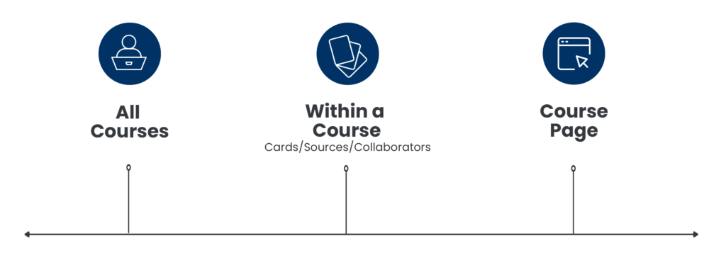
Our Builder tool goes three levels deep: Courses Library > Within a Course > Single Course Card. Each level has its own tools to help you craft your course.
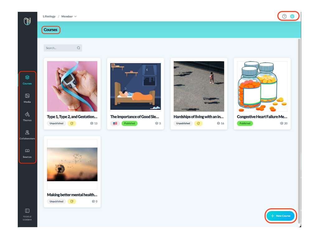
The Courses page is where you land when logging into the Builder. This is your library of courses built, each displayed as a tile. Any language versions created for a course are stacked behind the initial course.
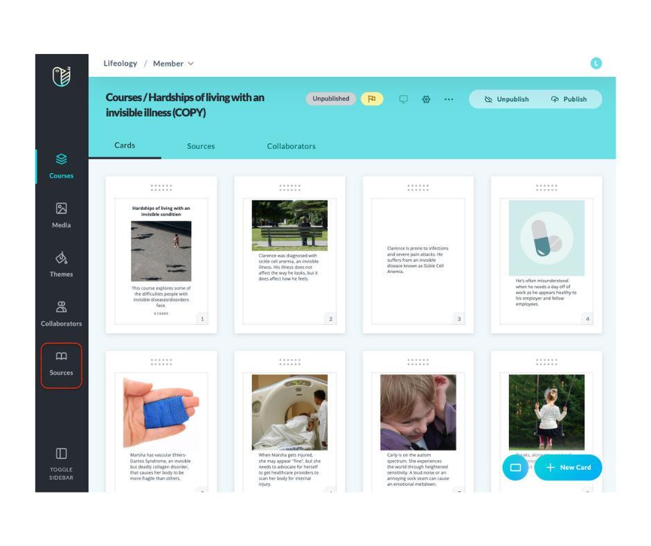
The layout within a course has three tabs along the blue header. The Cards tab displays all the cards created in your course deck. The Sources tab is where you can create a new source or attach a source from your Sources library to your course. The Collaborators tab is where you can create a new collaborator or attach a collaborator from your Collaborators directory to your course.
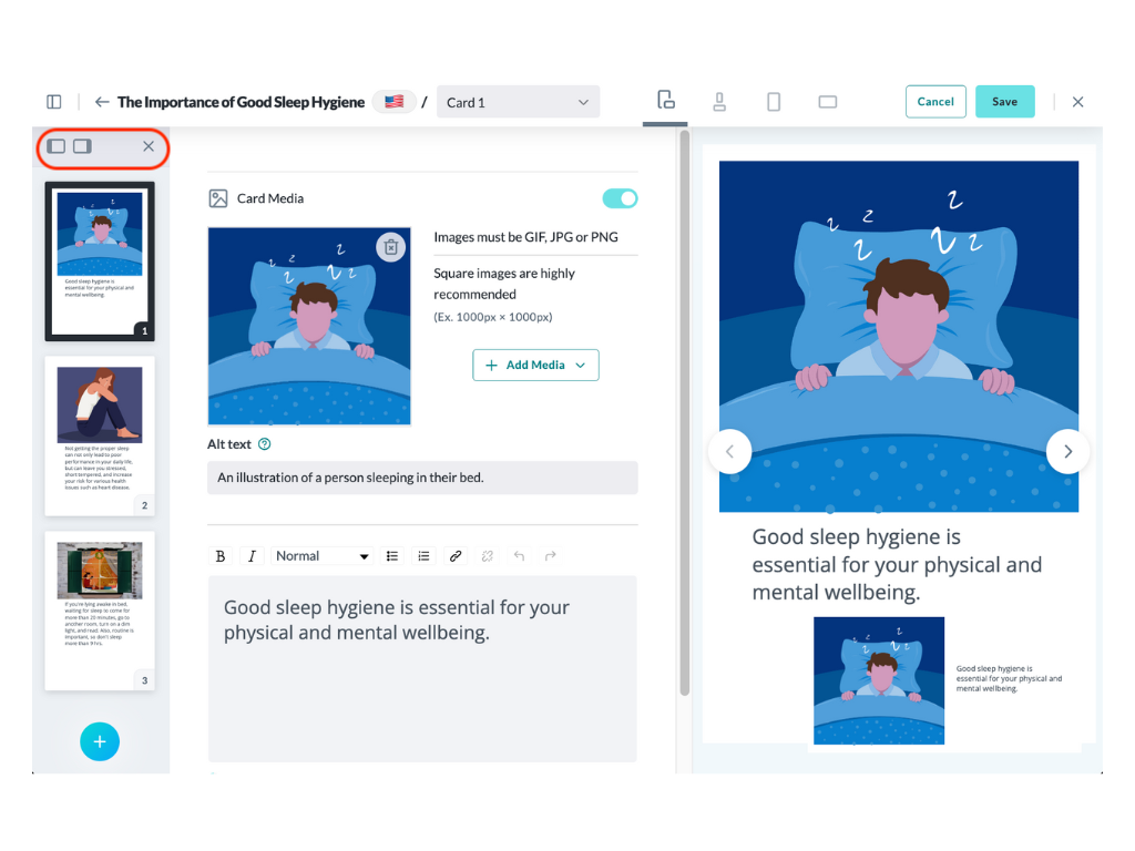
The Single Course Card shows the settings for your card. This may include the text and/or media, alt text, narration, and translation. The right side of the screen shows a preview of the built card. The sidebar lets you preview and select other cards in your course deck.
Account Settings Icons and Blue Header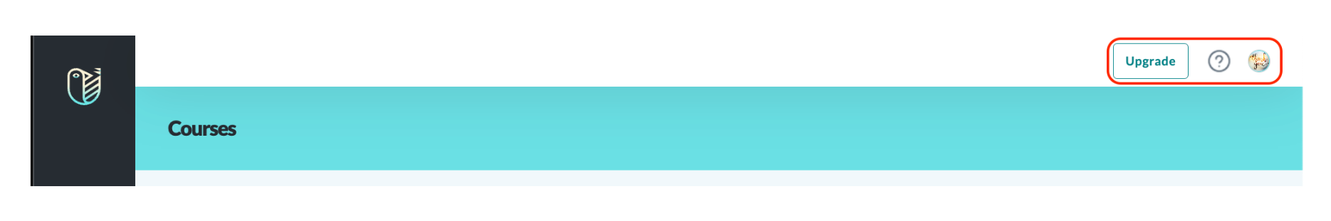
Icons along the top right of the screen allow you to access your account and billing settings. Options include:
- Upgrade button – Click this to upgrade your subscription tier
- “Walk Me” icon
 – Takes you to helpful articles on building a course
 - Your profile icon – Click this to access the Logout button and Account Settings
 (billing and subscription)
The blue header has breadcrumbs to let the user know where they are in the Builder (the example above shows we are on the Courses page ).
).
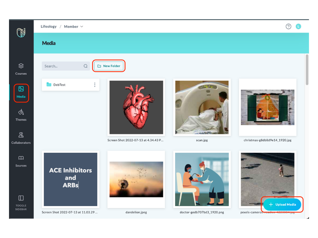
The black sidebar on the left side of the screen link to various libraries, directories, and pages. This sidebar is not seen on the Single Course Card page, instead, it has a cards sidebar. To minimize the sidebar, click the Toggle Sidebar icon  at the bottom of the sidebar. Available sidebar options depend on your subscription tier. Options include:
Displays a tile for each of your courses. Each tile includes the thumbnail image, title, language flag, published status, and the number of cards. You can also add a new course by clicking the +New Course button.
Displays your media library files and folders and allows you to upload media to the library.
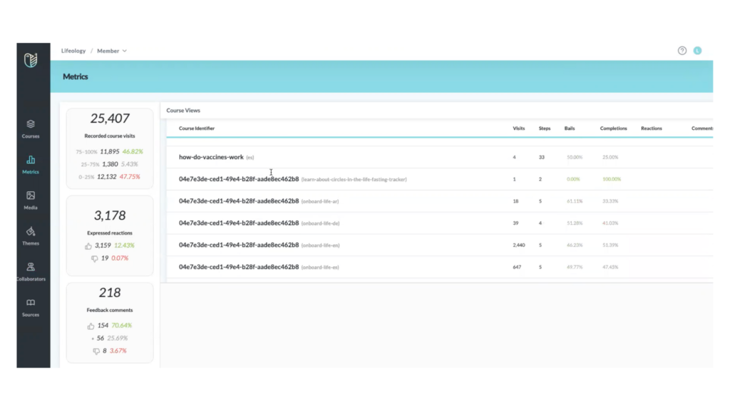
Metrics 
View your course data and feedback. (Only available for Enterprise-level subscribers)
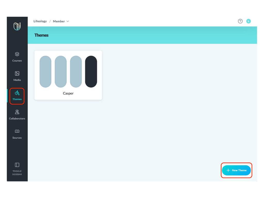
Customize your course by selecting the logo, colors, and style used on each course card to reflect your branding. You can also decide whether your audience can share or print the course from the Themes tab.
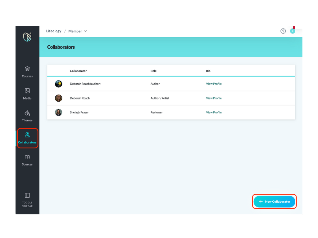
Your collaborators are those people who’ve helped you craft your course. They can include artists, authors, scientists, reviewers, and more! Add your collaborators to your library, then attach them from within your course to give credit where credit is due!
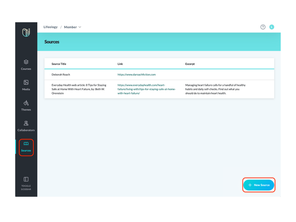
Add sources to your library, then, from within a course, attach a source to your course to show your audience you’ve done your research.
Next: Courses Layout