In this article, you’ll learn about:
- The single course card layout overview
- How to access a single course card
- The course card header tools
- The course card sidebar
Overview
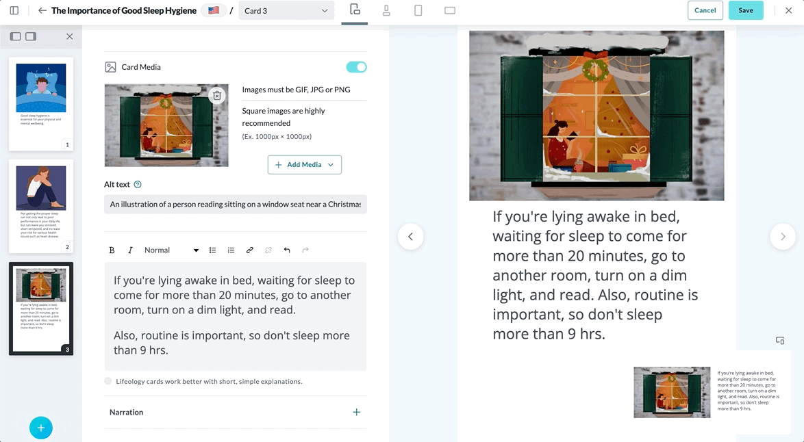
The single course card layout is where you build/edit your card. Select the card type you wish to build from our pre-formatted selections available in the card type dropdown, add text and/or media, add narration and alt text (optional), and preview how your card will look on various devices. You can also use the sidebar to navigate to other cards in the course or add a new card. For more information on cards, click here.
The single course card layout has:
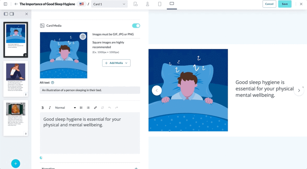
- Tools in the header to make building and viewing your changes easier
- A sidebar with previews of the other cards in the course (click these to access them)
- The course card’s media, text, and other settings
- A preview of what the built card looks like on various devices
Access the Single Course Card Layout
You can access the Single Course Card Layout by:
- Adding a new card:
- From the Courses library
 , hover your cursor on the course tile you wish to enter until tools are presented.
 - Click Edit Course. The Cards page for the course opens.
- Click the +New Card button or the add card icon
 in the sidebar. Now you can select your card type from the dropdown.
- From the Courses library
- Editing an existing card:
- From the Courses library , hover your cursor on the course tile you wish to enter until tools are presented.
- Click Edit Course. The Cards page for the course opens.
- Hover your cursor on the single card you wish to open until tools are presented.
- Click Edit Card.
- From the Courses library
Course Card Header Tools
The course card header has tools to aid your course building.
Single Course Card Tools include:

SIDEBAR TOGGLE
Click the toggle sidebar icon to make the sidebar appear or disappear.
BACK BUTTON
Click the back button to exit out of the single course card and return you to the cards layout.

COURSES/COURSE NAME
This acts as a breadcrumb, and shows you the name of the course you are in.

LANGUAGE FLAG
This flag represents the language you’ve selected for this version of the course.
CARD SELECTOR
Select the card you want to edit or view by selecting it from the dropdown card selector.
DEVICE PREVIEW
Select between the device options to see how your card displays on them.
CANCEL/SAVE
Use these buttons to cancel or save the changes made to this card.
CLOSE
Click the X to close the course card page and return to the cards tab of your course.
Course Card Sidebar
The sidebar of the course card displays the other cards in your course as well as the Add a New Card button . Icons above the sidebar  let you switch which side of the screen it docks or lets you close the sidebar by clicking the X. In the clip below, we swap what side the sidebar docks, then we close and reopen it.