Having started from a position of next-to-no graphic design experience, I’m pretty well-placed to offer tips on infographic design to those who are brand new to making infographics.
In the past seven years, I’ve made hundreds of infographics about various chemistry topics on Compound Interest, as well as making commissioned graphics for researchers and institutions. The purpose of these infographics has always been to make what are sometimes complex chemistry topics accessible to a general audience.
Here, I’ll draw on some of the things I’ve learned to highlight some of the key aspects of a good infographic and resources you can use to help you make your own.

The chemistry of hand sanitisers. An infographic by Andy Brunning.
Topic and scope
Before you even start making an infographic, you need to know what it will feature. If you’re making an infographic on a specific scientific study, that might seem straightforward. But you still need to consider what to include and what to leave out.
A large part of this will be dependent on your audience. An infographic for a specialist audience will look very different to one for a general audience. For a general audience, it’s a good idea to home in on what the key questions about the topic or study you’re focusing on. You can then use these to frame your content, creating hooks to draw the audience in.
By nature, infographics should be succinct, particularly when it comes to text. I often find it useful to write up short summaries of what I want to cover before designing an infographic. This helps me refine the content and focus on the most important points. It doesn’t always have to be exhaustive; a clear, narrowly-focused infographic is always better than a sprawling, muddied one.
Tools
You’ve honed the content you want to focus on. What can you now use to make an infographic?
For the Compound Interest graphics, I use a combination of Adobe Illustrator and Adobe InDesign. Illustrator has useful tools for the more artistic side of things, such as creating iconography, while I use InDesign to assemble my infographics.
There are free options for assembling infographics too, if you don’t want to shell out on new software. Free alternatives to InDesign include Scribus and the cloud-based Lucid Press, while Inkscape is an Illustrator alternative.
There are also free infographic generators online, such as Piktochart. While these can produce quick results, their features are comparatively rudimentary, and the results can look a little identikit, so they’re best avoided for serious infographic projects.
Design and layout
So, you’ve got your topic and the means of making an infographic. But before you start plugging content into an infographic, you need to think about its design.
Colour is one consideration. You certainly want to avoid ‘colour vomit’; a kaleidoscope of colours in your infographic. Pick a focused palette of two or three colours and try to stick to these for most of the infographic. Tools like Adobe Colour can be useful, and also have features to ensure that different colours are distinguishable for people who are colourblind.
The dimensions of your infographic will depend on its intended purpose or where it will be published. For Compound Interest, my original intention was that the infographics be printable as posters. Consequently, I design them using a template with normal printing dimensions. If you’re designing for online, dimensions can be more flexible.
The layout of content in your infographic should, as much as possible, follow the natural reading direction of the language you’re creating it in. So, for English, you want content to flow from left to right. This might sound obvious, but it can sometimes be hard to apply to the diagrammatic elements of your infographic. Of course, there will always be cases where there’s a good reason for avoiding this rule in diagrams – so use your discretion to decide what will make your infographic most comprehensible for your audience.
Finally, as you plan for the placement of content in your infographic, bear in mind the benefits of white space. If the content is too crowded together it can make your infographic cluttered and harder to interpret. Good spacing of infographic elements makes them nicer to look at and helps focus your audience’s attention.

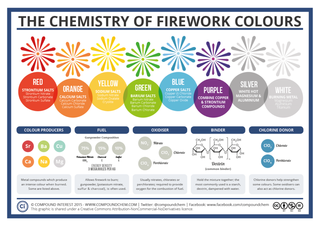
Fireworks! A fun throw-back but timely infographic by Andy Brunning.
Text and typefaces
Almost all infographics will contain at least a little text, and considering the typography of your infographic is just as important as its design elements.
You should usually settle on just one or two typefaces for your infographic. I often use a bold sans serif font for headings and the same typeface in a regular font for body text. For an infographic, comprehensibility is key, so avoid the temptation to use typefaces which might be in any way difficult to read.
Adobe Fonts offers a large number of infographic-friendly free-to-use fonts. Useful sans-serif fonts I’ve used in infographics in the past include URW Din, Bebas Neue, Roboto, and Open Sans.
Pictures and iconography
In my infographics, I’ll usually feature a larger picture or design relating to the topic as a focal point. A good picture is eye-catching and also helps split up content. Additionally, it can provide the colour variation in an infographic with an otherwise limited colour palette. Sometimes I’ll take my own photos for use in infographics, but there are also sites like Pixabay which have large numbers of public domain, free-to-use photography.
When it comes to diagrams, an infographic is more than just adding a few representative icons next to some text. Well-designed diagrams can help explain concepts and reduce the amount of complementary text needed. It’s important that what a diagram is depicting is clear, so make sure appropriate labels or keys are provided where needed.
When making diagrams, there are plenty of online icon repositories to help when it comes to icons if you don’t want to make your own from scratch. I frequently use icons from the Noun Project in the Compound Interest infographics.
Get feedback
When putting infographics together, it’s easy to fall into the trap of assuming that your diagrammatic representations will be crystal clear to everyone who sees them. As I’ve discovered, that’s not always the case!
I always find it useful to get quick feedback on infographics before I publish them. This can help spot typos and also ensure that your infographic elements are interpreted in the way you anticipated. It’s even better if you can get this feedback from someone who’s not a specialist, as it can help highlight any assumptions you’ve made or terms you’ve used which might not be clear if you’re targeting a general audience.
Adapting and improving
My first infographic efforts were a million miles away from my more recent work. If you don’t have a background in graphic design, there’ll be some inevitable trial and error while you hone your design style. Looking at infographic design by others for inspiration, getting honest feedback from friends and colleagues, and learning the various features of the software you’re using will all help you hone your own individual infographic style.
Have more questions about infographic design?! Let us know!
Participate in Lifeology’s June SciComm Challenge and create your own Infographic!


