In the month of June, Lifeology is setting forth the challenge to create a Science & Art infused infographic!
Infographics are a great way to tell a scientific story, because information encoded in a graphical style simply connects more with your audience.
“The human brain is more able to identify and comprehend relationships and patterns if data is encoded into visual forms.” – W. S. Cleveland, “The Elements of Graphing Data”, 1994
We believe that infusing Art in Science is the future of Science Communication, which makes this an incredibly important skill to train!
In our increasingly uncertain future, science communicators will have to improve the connection they have with their audience – especially for topics around risk & uncertainty. With this in mind, the theme for this month’s Infographic Challenge is around Communicating Risk & Uncertainty in an Uncertain World.
What topics can this theme conjure up in our mind?
♦ Any aspects of climate change – modelling, mitigation, or policy making!
♦ Health risks – either from pathogens & diseases, the medication used to treat them, or even from our own behaviours.
♦ Basically anything future-facing, which can have uncertain outcomes with pros & cons to be weighed up.
However, if your infographic idea doesn’t involve risk & uncertainty, not to worry. The goal of this challenge is to encourage people to practice telling a scientific story with artistic flair! So we’ll happily accept any form science infographic.
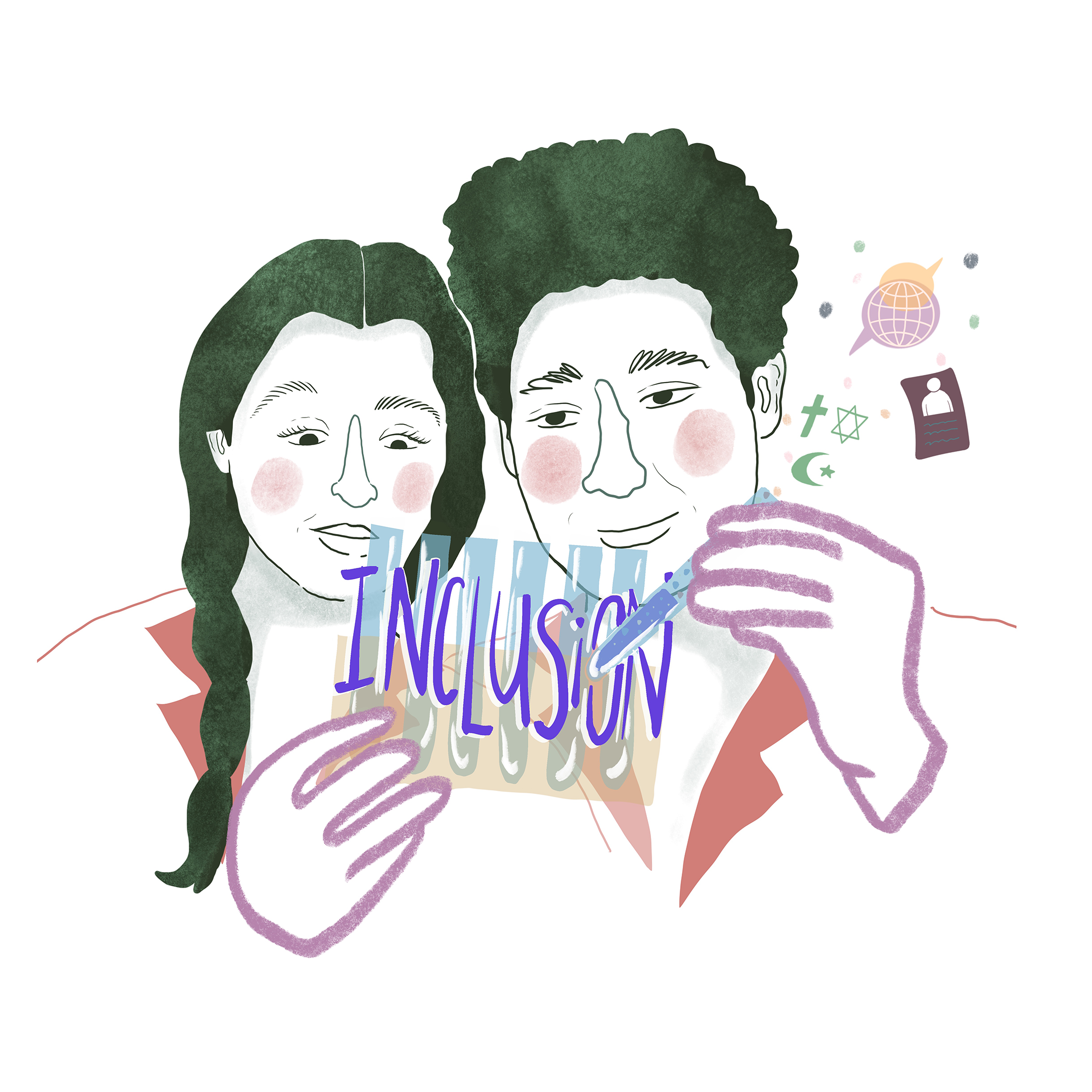
Infographic Challenge Infographic
In the spirit of the challenge, we’ve created the following infographic to present the Lifeology Infographic Challenge!

Infographic Challenge Details
Challenge: Create Your Own Infographic
Theme: Uncertainty & Risk
Due: June 30, 2020
Submission: Email to Lifeology@lifeomic.com
Prize: It’s a surprise (and may or may not involve knitting!)
Infographic Chat: A chat to learn about infographic creation from experts, June 12 at 10am Pacific / 1pm Eastern, on the Lifeology Slack workspace!
Try your hand at communicating science while incorporating elements of Uncertainty & Risk. This is often referred to as one of the hardest aspects of Science Communication, so get some practice on it with this Lifeology Challenge.
You can send your infographic to Lifeology in any format that works for you. Feel free to ask for advice on our Lifeology Slack channel anytime during the infographic-making process – we’re very friendly! :) Also, if you’re interested in working with an artist on this challenge, you can email us to help you connect with an artist, or find collaborators at Lifeology.io/members.
While you can get fancy with your infographic tools and software, such as Adobe Illustrator, you can also use simple free tools like Canva, Venngage or Piktochart.
Designing Your Infographic!
Read the following advice from Matthew Griffiths (designer of the Infographic Challenge infographic above!) about how you can design your own infographic:
STEP 1
Choose the data.
What is the fact or figure you’d like to depict? Choose something you think is interesting and try to keep it simple. Overly complicated data makes it harder to depict visually, so perhaps start with something straightforward. Maybe your data is a comparison to show the growth or decline of something, or just how different they are. Perhaps it’s the short story of how something works. Now’s a good time to figure out what your key message is, what is the main point you’re trying to make to the audience?
STEP 2
Visualise.
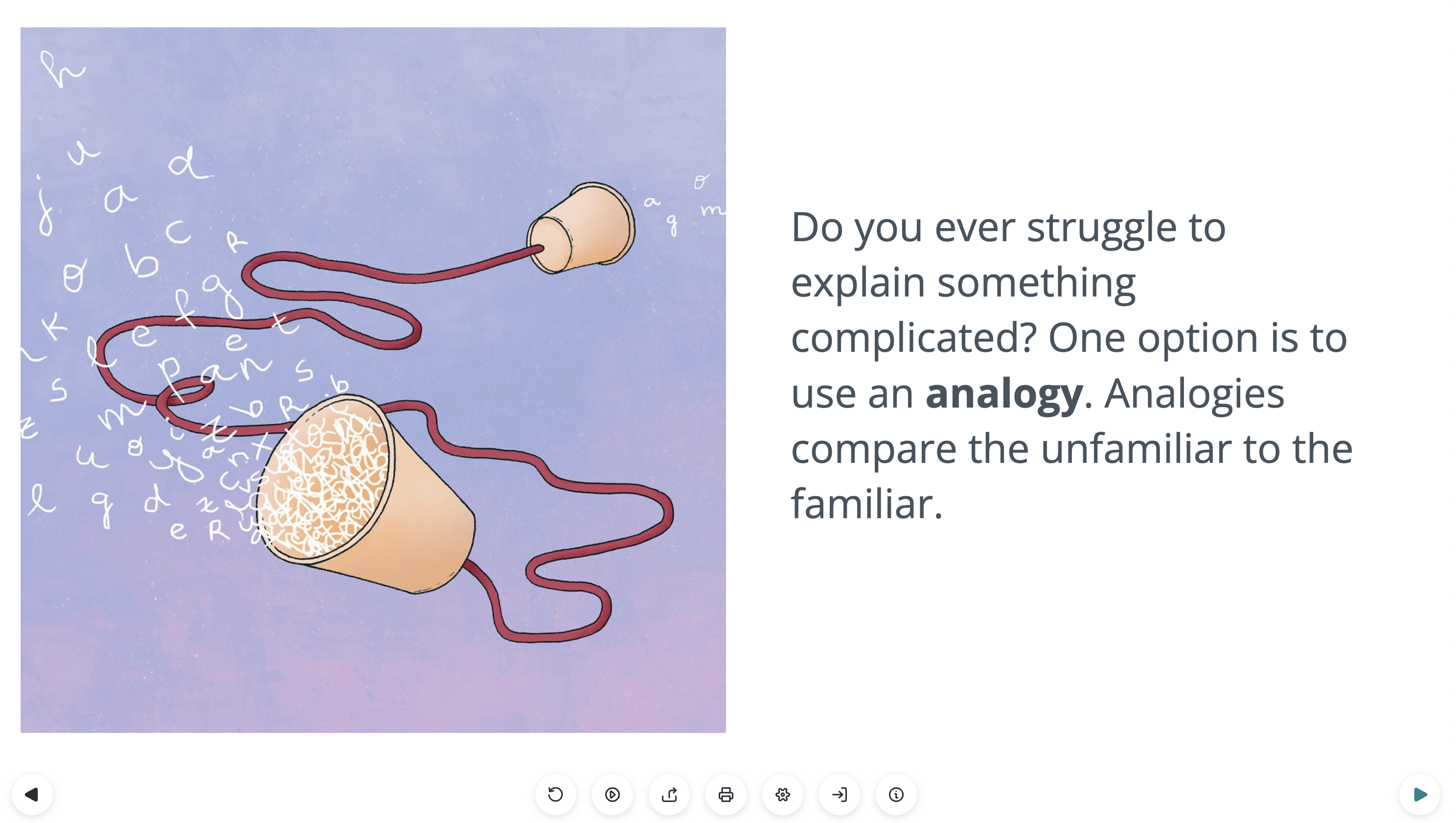
The data you’ve chosen has a subject, so what are the visuals that go with it? For data on populations you might choose a person icon. If you’re looking at forests being cut down you could choose some aspect of a tree, such as growth rings. Can you use a visual metaphor to display your information instead of a line graph? Perhaps your information is best shown using a map? The internet will have a wealth of imagery on your topic if you’re looking for inspiration.
Simplify, this is what will make your data easy to understand.
STEP 3
Flow.
What is the flow of your information. Can you order the information by priority? Where do you want people to start and end? We tend to read from top left to bottom right, but you can also guide your viewer using lines (read here first, follow the line and now read here). You can also emphasise pieces of information using bigger, bolder text or by highlighting it with a bolder color.
STEP 4
Colors.
Good color choice can really emphasise your data. If something is going from good to bad it could go from a healthy color such as blue or green, to a warning color such as yellow or red. There are great color palette websites like Coolors.co if you need some inspiration or guidance.
STEP 5
Play.
Have some fun with it – try out different layouts, icons and colors. Do little scribbles to find out what works best. Often what we have in our minds doesn’t work out that well on paper and we need to adjust. The best infographics are clear (this often means keeping it simple) and consistent, this means using the same visual theme, scale and formatting across the infographic.
More Infographic Resources…
Lifeology’s other partner in this Infographic Challenge is Gaius J. Augustus, a visual storyteller with over 10 years of formal training in art & video production. Check out these informative blog posts by Gaius to further hone your infographic-making skills!
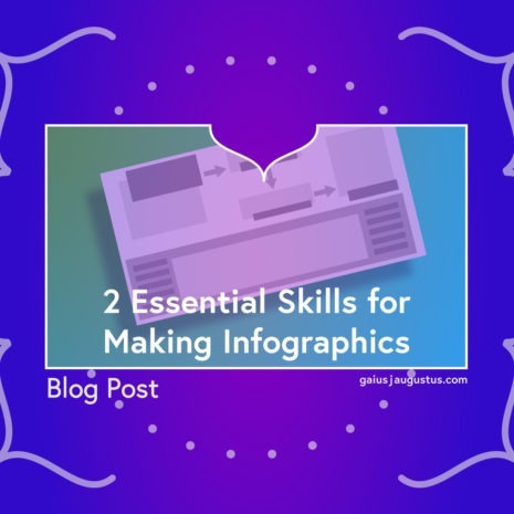
2 Essential Skills for Making Infographics
Two basic skills are needed to make infographics: simplifying science and artistic skills. In this post, we talk about how to get started on each…
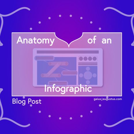
Anatomy of an Infographic
What are the common elements of every infographic? In this post, you’ll learn how to prepare these elements for your infographic. Create a plan to make your own infographic!
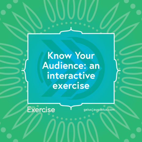
Know Your Audience: An Interactive Exercise
You must know your audience to create any form of visual science communication! Learn my go-to method for simplifying science your infographics.

The Secret to Choosing Infographic Size
An important decision needs to be made before you finalize your design! You’ve decided to make an infographic. But what size should you make it? Here, I answer some of the most common questions I get about infographic size.
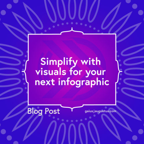
Simplify With Visuals For Your Next Infographic
Ready to make your own infographic? You’ll need visuals to go along with it! Use these visual exercises to bring your infographic to life!
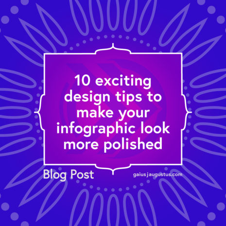
10 Design Tips for a More Polished Infographic
As you fine-tune your design, this post will come in handy. You can make your infographic look more polished with a few basic principles of design. Here are 10 design tips to take your infographic from meh to amazing!
About the Lifeology SciComm Challenge
Each month, Lifeology is hosting SciComm challenges help you learn more about the science and practice of communicating science for broad audiences. These challenges give you the opportunity to practice communicating science more engagingly in a range of formats. Learn more about Lifeology.io
Submit your Lifeology SciComm Challenge Infographic to Lifeology@lifeomic.com by the last day of the month!
Your infographic will be featured on the Lifeology blog and our favorite entry each month wins a prize – a surprise one this month!
About Lifeology
Lifeology is a platform and a community space that brings together scientists, artists, writers and broader audiences in the creation of more beautiful, engaging and fun science educational content, including mobile-friendly Lifeology mini-courses that can reach anyone.