Every week, we feature new artists here! This week we are featuring Jessika Raisor, her story, advice for other artists and scientists, and work illustrating Lifeology courses with us! You can see her course on being mindful in nature here.
Meet Jessika!
Tell us about you! How did you get into art?
Hi! I am an animator and educator for all things science! I always liked art, but didn’t decide to pursue it until 8th grade. That is when I got into animation in particular as well. Before that my life goal had been to be an astronomer and study dark matter! Turns out, I loved making pictures move more than chemistry class.
Eventually (6/7 years later), I learned how to combine my interests in the natural world with my love for art and animation!
What are your favorite things to illustrate?
Insects! For full blown, final illustrations, I love drawing all sorts of bugs. When I volunteered at our local insect collection, they had an old Camera Lucida for their microscope and I drew a lot of insects that way and fell in love with that vintage way of creating scientific illustration.
When I am just drawing for me, I always doodle silly, bizarre faces or characters. That’s what comes most naturally to me.
A time-lapse of an illustration by Jessika for “Mother Nature’s Embrace”, a Lifeology course.
Let’s talk about your Lifeology course illustrating! What is the first thing you do when illustrating a course?
When I read over the script [the written “flashcard” content] I immediately jot down or comment the first thing that comes to my head. Of course sometimes that is not the best answer, but it gives me a jumping off point when I go back. And if the idea isn’t good, I’ve figured out what wouldn’t work or communicate the idea effectively.
After that, I try (via sketching or thinking aloud) to figure out the art style that helps tell the story that the course has. I love experimenting with different art styles so this part is the most enjoyable to me!
Can you talk a bit about visual storyboarding for a Lifeology course?
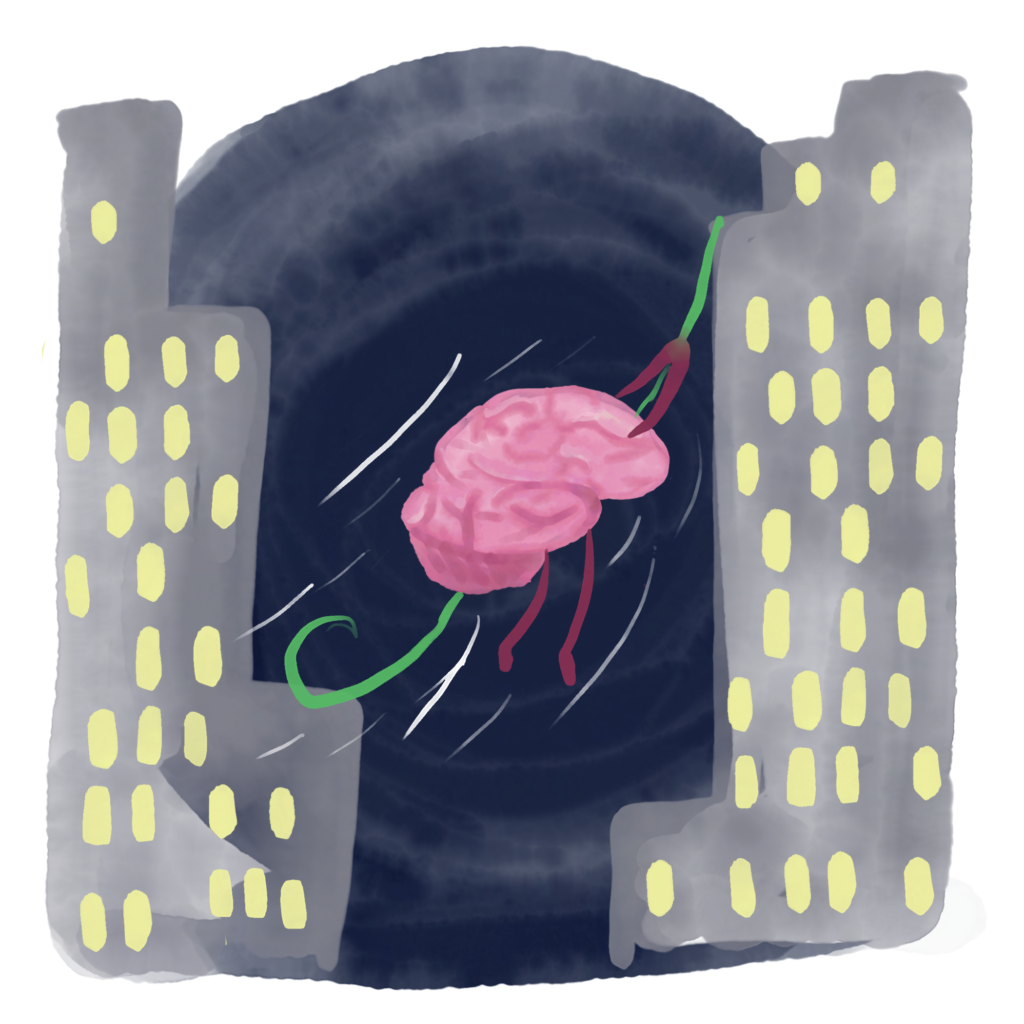
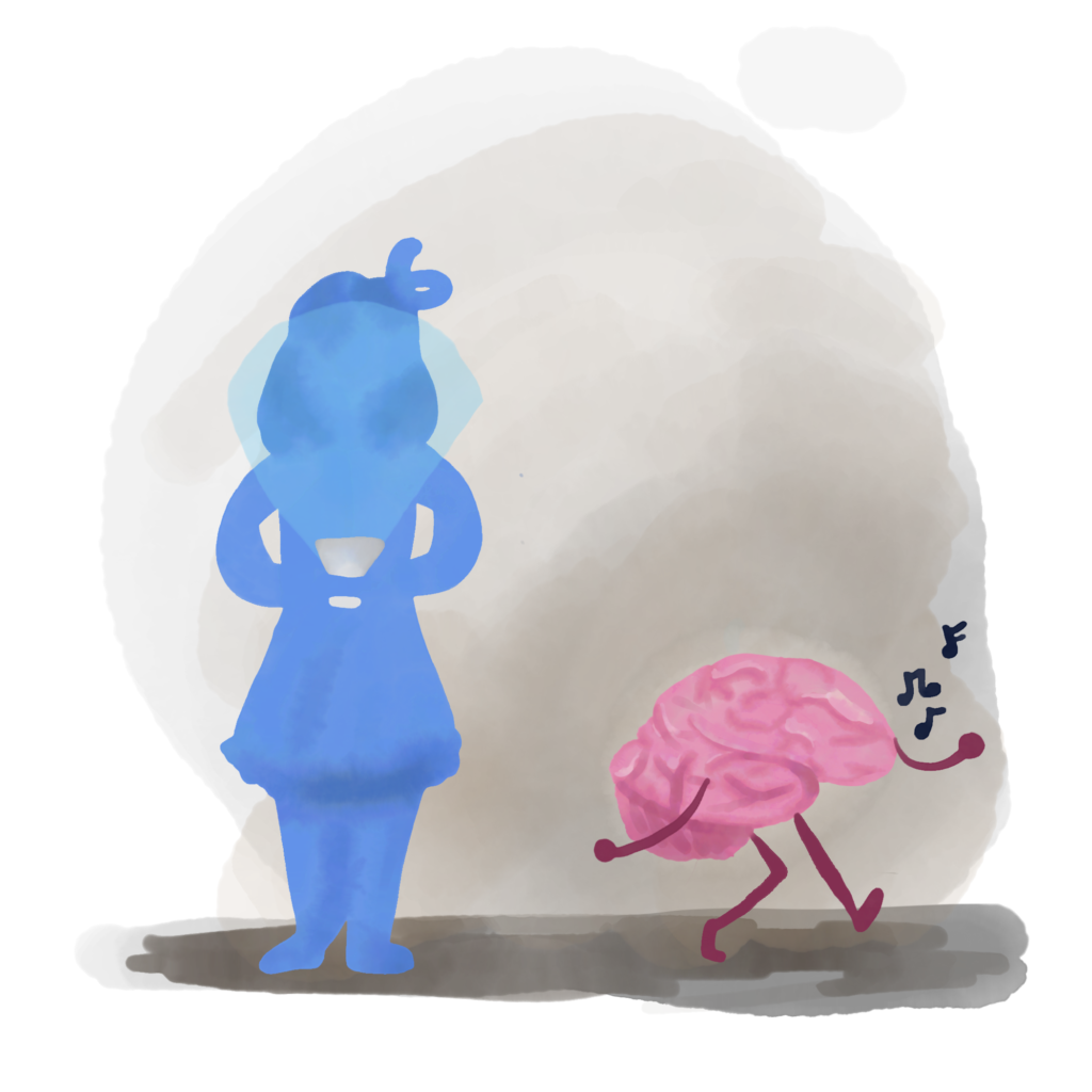
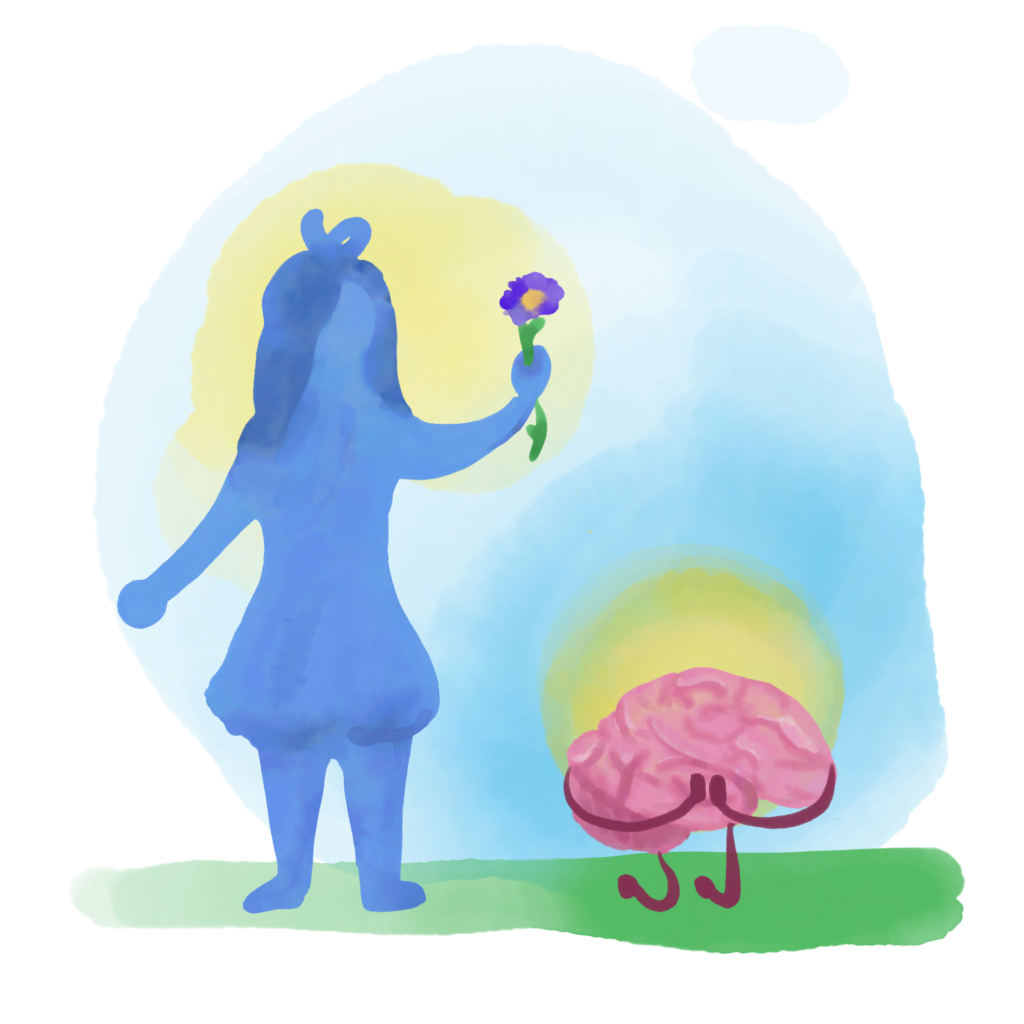
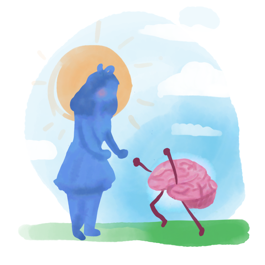
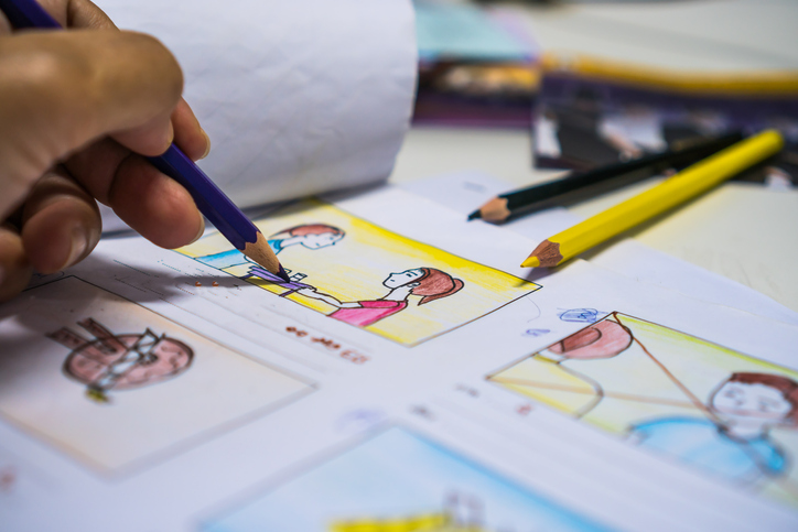
Seeing all of the cards laid out in front of me so that I can see how they interact is integral to creating a successful course. If the jump between cards by colors or even style is abrupt (and not called for by the text or topic) it can make the user feel disconnected from the narrative. It also lets me see if there is room for a repeating theme, like in my mindfulness course, where we found that there were a lot of chances to include a brain character to connect separate ideas together.
What do you think are the top 3 things an artist needs to consider when illustrating a science idea?
1. Who do you need to communicate this too? The way you deliver information and the amount of it is different for a 10 year old in 5th grade than it is for 21 year old health major in college.
2. What needs to be shown artistically vs. accurately? Having done medical illustration, this is always an important question. It connects back to the audience as well but separate from that, why is this being drawn and not photographed? Take surgical art for example – a photo has too much information and it isn’t very clear. With an artist’s eye you can declutter and show what the surgical assistant needs to see even though that isn’t exactly what it will look like in the surgery.
3. What’s the best way to show this? There isn’t a one size fits all style or way to show a scientific topic. Something may need to be animated, or charted. It may need to be more of an abstraction or perhaps lifelike instead.
How is illustrating a Lifeology course different (or not) from other science illustrating you’ve done?
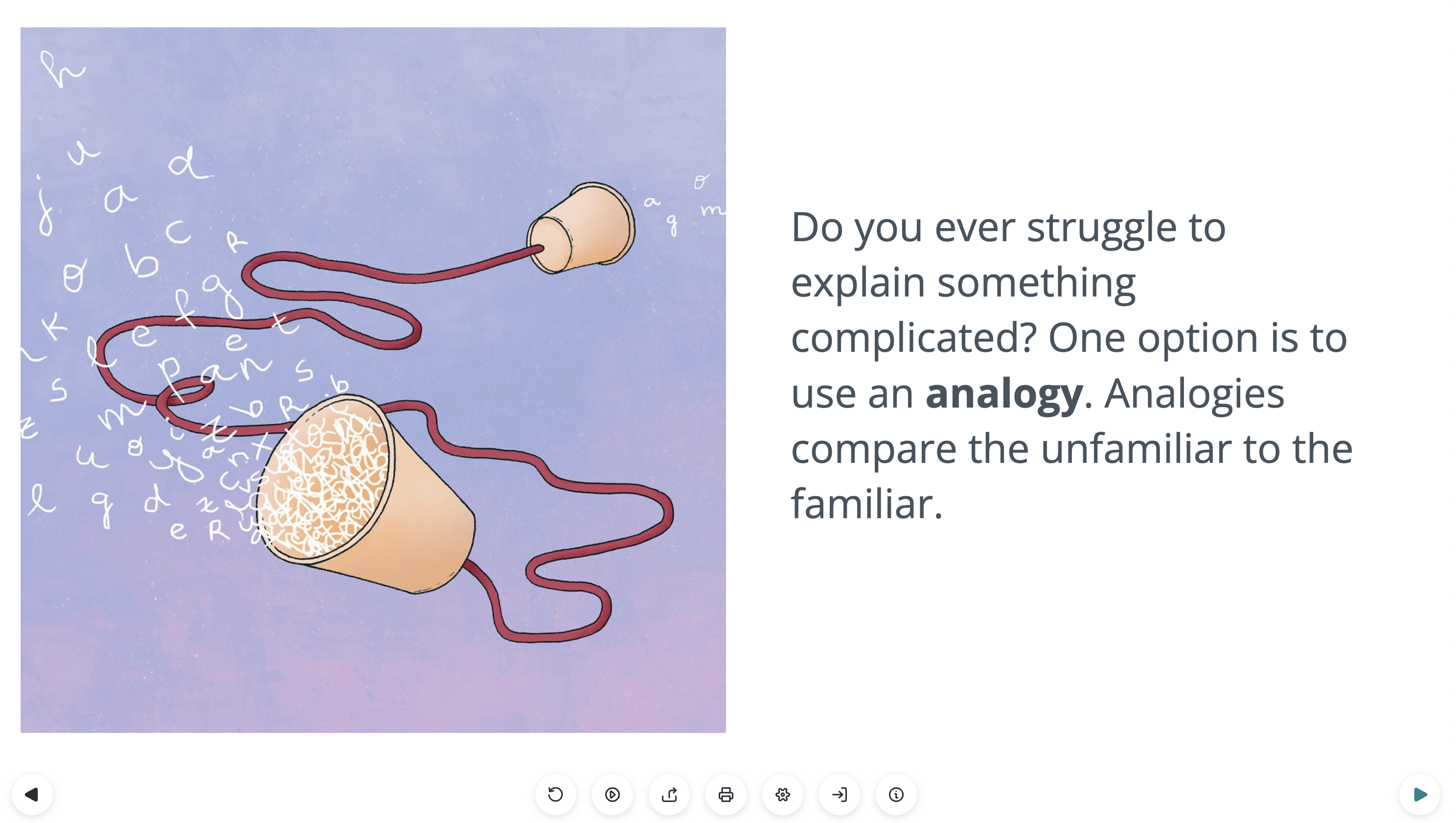
Most of the work I have done has to stand on its own as the art piece itself, whereas Lifeology courses have the text that is conveying most of the information and the art is there to interpret, typically in a more abstract way, what the text is saying. So the art and text work together to get the concept or information across as clear as possible to visual and non-visual learners alike.
Can you talk a bit about character building through visuals?
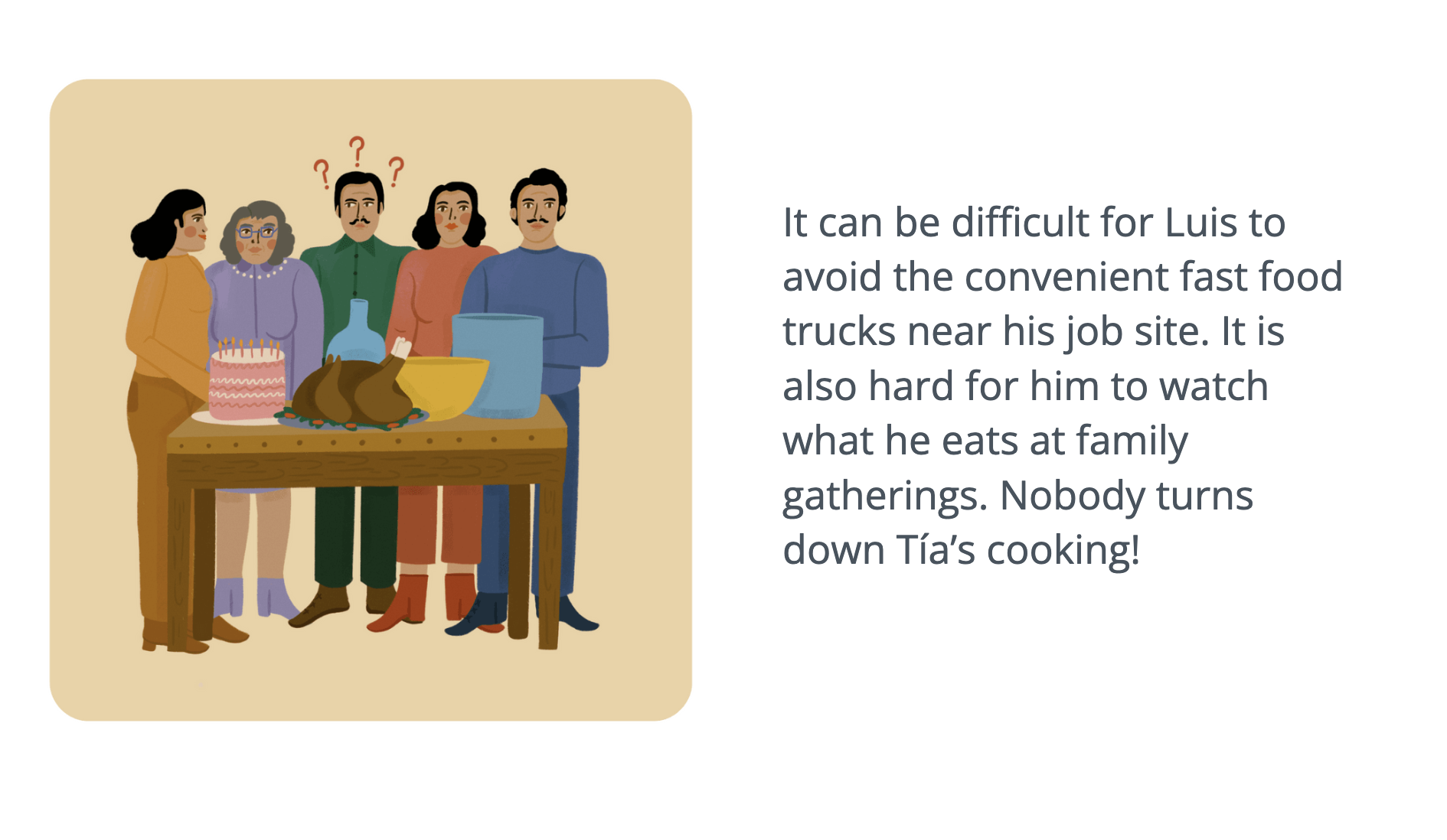
I have a cartooning background so I just think characters are fun! Since I create a lot of work for younger audiences, characters work the best I find in creating a connecting string across your information load.
Constantly looking at abstraction, diagrams, cells floating around, whatever, can be draining and boring, but with the added character (human or not) you have an interesting, emotional connection for the user to make. And I think that helps hold people’s attention just that much longer.
What tips or advice would you offer another artist working on illustrating a Lifeology course?
Try not to take everything super literally. People read the text and they have that information. Repeating it visually doesn’t help much. Use your space to further their understanding and not repeat it. Sometimes the literal has its place, but not on every card!
What tips or advice would you offer any other artists working with scientists to create art/illustrations for broad audiences?
When your audience is everyone, you have to assume they know next to nothing. As soon as you assume they have more advanced knowledge, you alienate a ton of your audience.
In creating science artwork, you have to understand the research as well as you possibly can first. And then you need to decide what information isn’t needed or what can be combined when visually communicating this work to a broad audience. But perhaps the trickiest part is figuring out how to relate the science to a “general audience.” I always like to think back to “what helped me learn this” or “what did I have no clue about going in”.
Why should more scientists work with artists?
Because we are super cool! But besides that, science jargon and research is not readily accessible to people. Blocks of text, diagrams, all are great when one decides they want to learn more on their own, but they are a huge hindrance to those who aren’t interested in your topic.
Artists like me make that work accessible and fun and highlight all the fascinating tidbits about your work!
