In this blog post, Alice Fleerackers reviews tips on creating effective visual aids and data visualization that can help people understand risk. Read on, and also consider creating your own visual aid as part of our November Science Communication Challenge! Here is an example from a Lifeology community member to inspire you, about anti-microbial resistance.
If the COVID-19 pandemic has taught us anything, it’s the importance of communicating health risks accurately and effectively. While many science communication efforts have worked well, others have not. Even now, more than half a year into the pandemic, some segments of the population continue to suffer more than others.
Could visual science communication help fill the gap? To find out, Lifeology’s October SciArt Reading Club meeting focused on the benefits and drawbacks of visual aids as health risk communication tools. Visual aids are simple data visualizations, like bar chars or icon arrays, that can be used to portray information about risk and statistics — either alone, or alongside text. Done well, they’ve been shown to help people make sense of complex risk information, like statistics about treatment side effects, illness recovery rates, and more.
Check out the following visual aid created by virologist Ian Mackay, which communicates various protective behaviors toward COVID-19 as slices of swiss cheese… no one behavior is sufficient to protect you by itself, but when used together are extremely effective.

To learn how visual aids can help science communicators craft powerful health risk messages, we read a systematic review by Rocio Garcia-Retamero and Edward T. Cokely. The review analyzed more than 35 studies testing the effectiveness of visual aids in health communication. Although it focused largely on bar charts and visual arrays, the findings offer some important insights for scientists, science artists, and other visual science communicators:
Statistics alone are not enough!
“Across all studies, results converge,” write Garcia-Retamero and Cokely, “many people do not possess basic, practical mathematical skills that are often essential for independent risk evaluation and general skilled decision making.”
One of the most important takeaways from the paper is how few people possess the basic math and statistics skills needed to make good decisions about their health and wellbeing. For example, more than a quarter of Americans have trouble understanding that a risk affecting 1 in 10 people is larger than one affecting 1 in 1,000 people.
It isn’t just Americans; similar rates of low numeracy have been observed globally, with residents in countries as far as Germany and Japan struggling to make sense of basic numerical risk information. Even more concerning, between a quarter and half of physicians seem to be unable to answer basic numeracy questions.
The implications for science communicators are clear. When it comes to helping audiences understand risk information, statistics alone are often not enough. That’s where visual communication tools can help.
Examples: Check out this 3D simulation of why social distancing is important, published by The New York Times. Or this simulation of spread via aerosols, and how ventilation of a room can help.
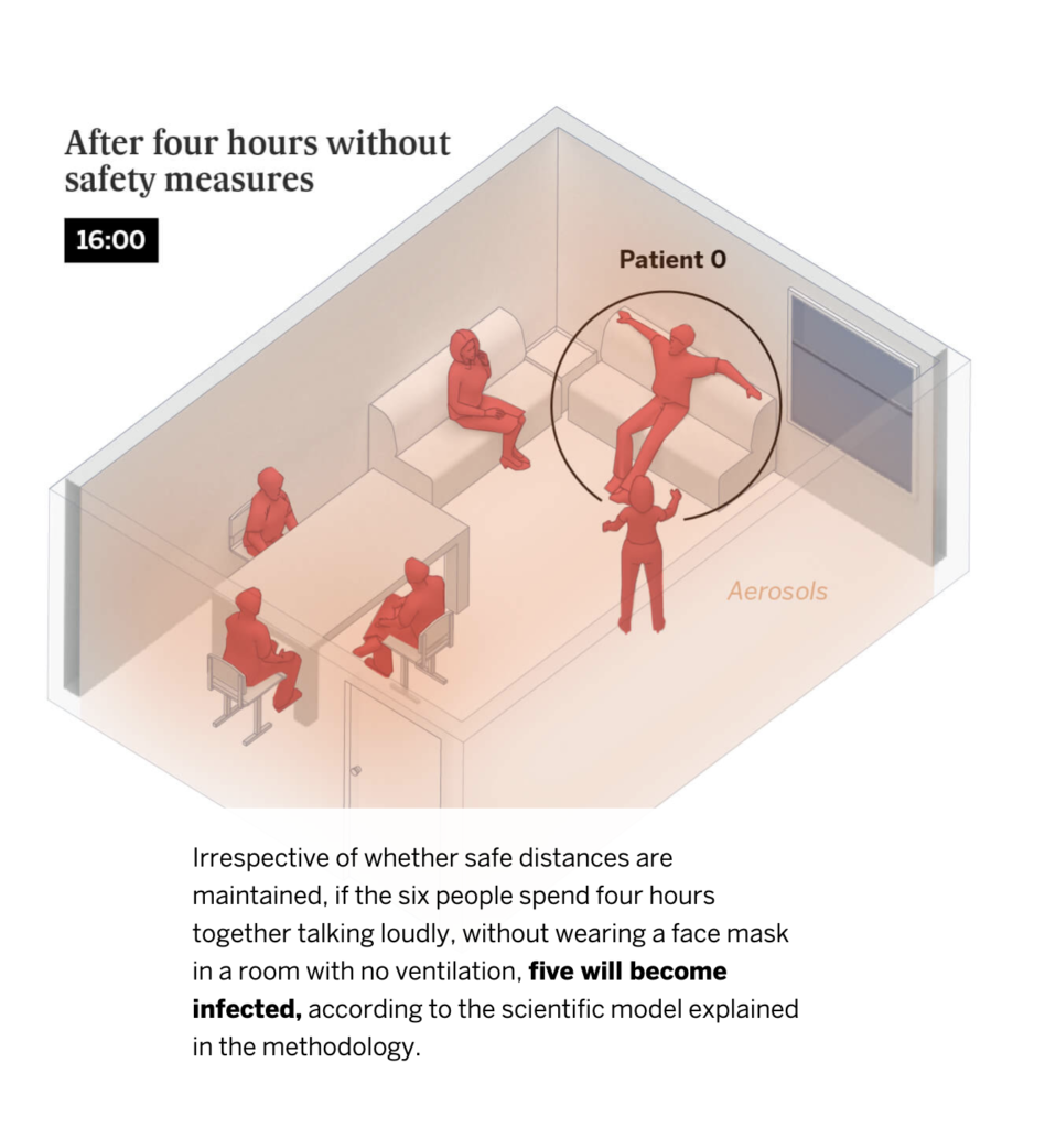
Screen Shot from El Pais simulation of contagion in indoor spaces
Visual aids are powerful risk communication tools
Luckily, there’s strong evidence that using visual aids can help audiences understand health risks and make better decisions. In Garcia-Retamero and Cokely’s review, almost 90% of studies testing static (i.e. not interactive) visual aids found that they improved audiences’ risk literacy and/or promoted healthy behavior.
This was especially true for people who struggle to understand numerical and statistical information—that is, people with “low numeracy”. In 67% of studies, people with low numeracy benefited more from visual aids than those with high numeracy.
Importantly, Garcia-Retamero and Cokely also identified a range of different factors that can influence how (in)effective a visual aid is. For example, not all people respond to visual aids the same way; for people with “low graph literacy,” adding a visual aid to a text-based risk message is not always helpful.
In addition, not all visual aids are created equal. Factors like the degree of interactivity, the choice of format, and the use of scale can all affect how effective a visual aid is. Together, these findings emphasize the importance of knowing your audience and tailoring your visual aids to meet your communication goals.
So how do you make a stellar visual aid? The authors offer five evidence-based tips for taking your visual communications to the next level.
Evidence-based tips for crafting effective visual aids
#1. Keep it simple
You’ve heard it before: “less is more.” The same is true for visual risk communication.
For best results, the authors recommend keeping visual aids as simple as possible. Avoid unnecessary decorative elements, like shadow or 3D. Add clear captions and plain language labels to help audiences make sense of the visual data. Only include interactivity if it encourages people to engage more deeply and critically with the information presented to them. If it isn’t supporting the audience’s learning, scrap it.
Garcia-Retamero and Cokely also stress the importance of being selective: Include only the most essential information—just one key message per aid. Remember, if you have more than one message to communicate, you can always create more than one visual aid!
#2. Choose the format that aligns with your communication goal
Garcia-Retamero and Cokely highlight the importance of tailoring visual aids according to the type of message. Bar charts are best for comparing different data points to one another, while bar graphs help chart changes over time. Icon arrays are a great way to communicate population-level statistical information, like the effectiveness of a particular treatment or its likeliness to produce side effects. Pie charts, on the other hand, are great for communicating overall proportions.
#3. Complement visuals with numbers and stats
Not everyone finds visual aids helpful! You can help the less graph literate folks in your audience understand your message by including textual and numerical information alongside your graphic.
When you do, use frequencies rather than decimals, fractions or percentages, and absolute rather than relative risks. Garcia-Retamero and Cokely also recommend paying attention to how you frame the information. For important risk statistics, use both a positive frame (e.g. “This medication is helpful to about 70% of patients”) and a negative frame (e.g. “This medication is not effective in about 30% of patients”). Keep time frames consistent so that people can compare different statistics easily.
#4. Tailor visuals to meet audience needs
The best visual aids keep the audience’s needs and skills front and center. Take time before your communication campaign to research the target audience. What is their reading level like? What language do they prefer to communicate in? How comfortable are they with numerical and statistical information?
If your target group has low numeracy, be sure to include a visual aid—especially if they also have limited education or knowledge about medicine.
For people with low graph literacy, complement your visual aid with simple labels and written explanations that help them make sense of the information. Include reflective questions about the risk information, encouraging people to engage actively with the content. In some cases, you may even want to skip the visual aid entirely. Basic statistics may be better for people with very limited graph literacy.
#5. Test your visual aids before using them
Finally, remember to test your visual aid before putting it into practice! Host focus groups, solicit feedback and conduct usability studies (cognitive process tracing, like eye tracking, can be especially effective). The more you can involve the target audience in the design and evaluation of your aids, the stronger they’ll be.

COVID-19 Risk Chart, https://library.stockton.edu/publichealth/COVID-19