Lifeology Data Visualization Challenge

This November, Lifeology is challenging you to create a Data Visualization submission and win a Design consulting session with Lifeomic’s VP of Design, Doryan Algarra.
Data Visualization is the presentation of data in a pictorial or graphical format. Let the visuals communicate the information!
The concept of using pictures to understand data has been around for centuries, from maps and graphs in the 17th century to the invention of the pie chart in 1801, credited to William Playfair’s Statistical Breviary.
Technology has opened the door to multiple formats of data visualization…but which can we trust? And which presents the information in an authentic and creative way? Understanding and communicating data relies more and more on data visualization. There are so many available options, but this can be so overwhelming! There are even apps like Tableau Public that can help us build data stories and share them with the world.
Last month, the Lifeology SciArt Reading Club discussed data visualization and How to Spot Visualization Lies with Alice Fleerackers. Here we discussed some of our favorite examples:
- Rickie van Berkum uses hand-knitting as a medium to tell the stories of science
- Dear Data collects and hand draws their personal data in the form of postcards
- Couple in data uses photography to show the funny side of data
- Giorgia Lupi is an information designer who explores data in a variety of formats
- Pentagram’s Global Goals Factivism is a series of data visualizations that highlight the Global Goals for Sustainable Development
Your challenge:

There are two options for this data visualization challenge!
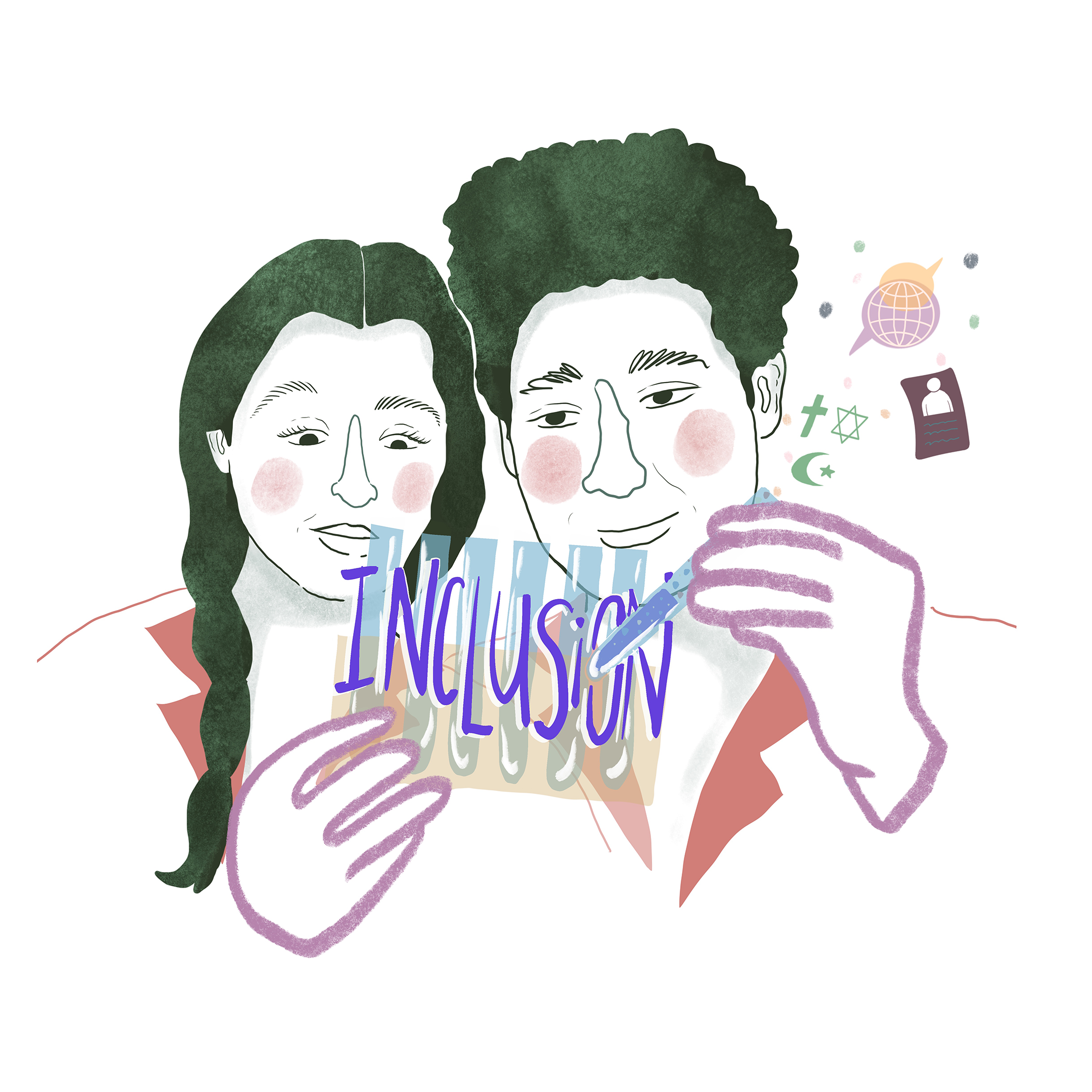
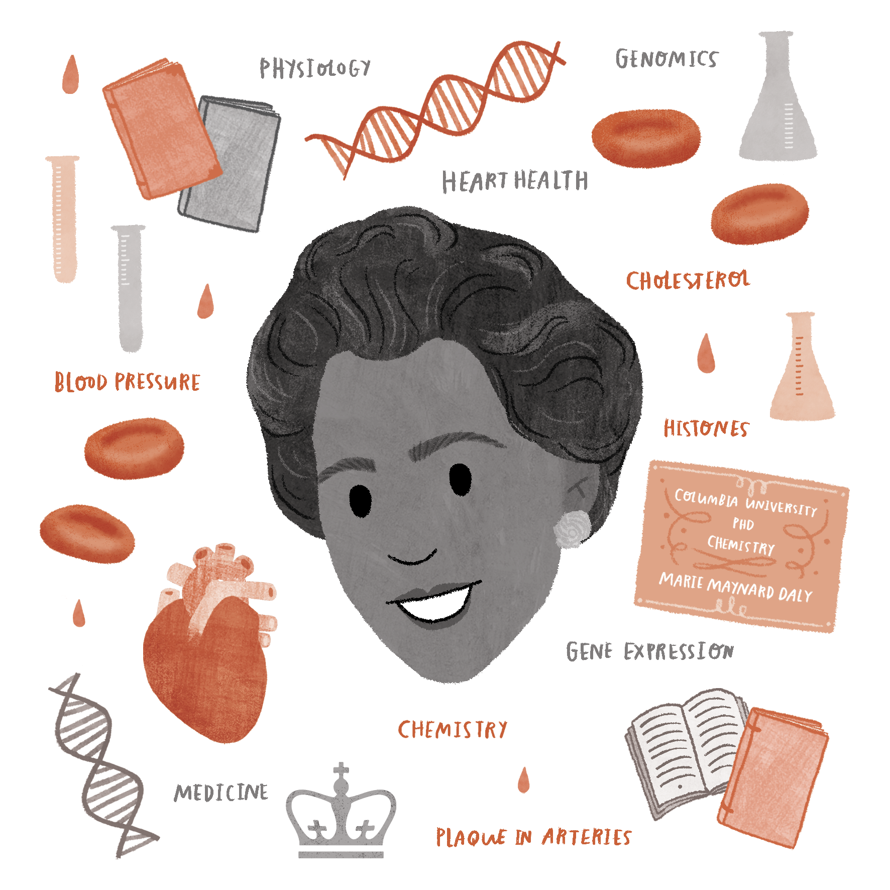
Option #1 – Create a data visualization for one of these November Health Awareness Events using the health/science data links provided:
Lifeology will be promoting these Health Awareness Events and we would love to be able to promote your work in a blog and social media post!
Option #2 – Use your own research data for data visualization. Produce a data visualization yourself or team up with a scientist to help visualize their data. We will be promoting this challenge in our Slack Workspace – find a SciArt match there!
Tips and Data Viz Resources:
- Know your data before trying to communicate it
- Find ways to complement visuals with text – don’t oversimplify (unless the data is simple)
- Think about placement, size, emphasis, hierarchy, etc.
- 18 Data Visualization Resources for Education and Inspiration
- Best Data Visualization Resources
- Get inspired to visualize your own data by this Data Viz of Who’s at Lifeology!
Send your entry to Lifeology