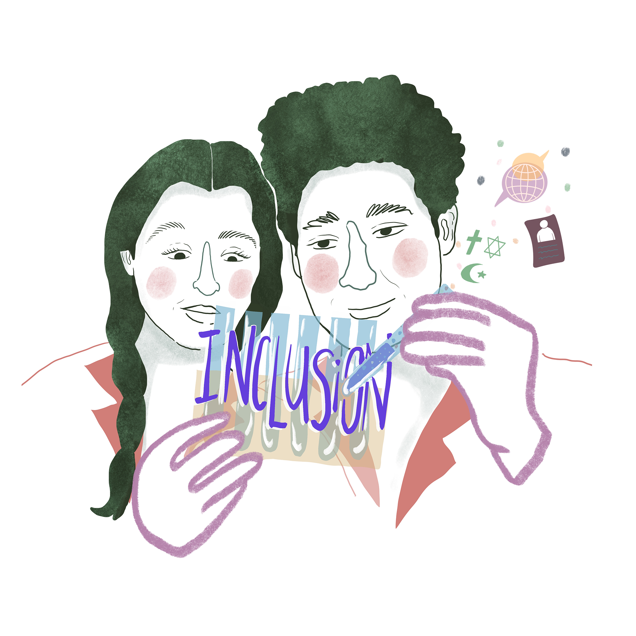
Data visualization is an essential part of any scientist’s communication toolbox. If done well, it’s a way to communicate a vast amount of complex information in a concise, visually-appealing way.
Karen Murchie & Dylan Diomede, authors of a recently published research article about the Fundamentals of Graphic Design, assert that visual language is one of the most effective forms of science communication.
They present 3 reasons why they believe this is true:
- The beauty of data visualization is that it appeals to a broader audience… it’s more engaging and wins the competition for attention.
- Visual communication applies across cultures, languages & generations.
- Visual communication helps your research become more visible… and more importantly, more understood.
“The visual language spans all ages, cultures, and experience levels, and is arguably the most effective form of science communication” – (Murchie & Diomede, 2020)
")

")
Figure 2: The 3 reasons why visualization is an effective form of science communication.
(Murchie & Diomede, 2020)
Join the Challenge and create your own Data Visualization!
Our November SciComm Challenge for you is to create a Data Visualization using either your own research data (or data of a scientist you’re collaborating with), or a publicly available dataset – find some suggestions here!
Check out the challenge blog post for more information about the challenge and to find some great tips and resources to help you along the way.
Who’s at Lifeology? DataViz Inspiration
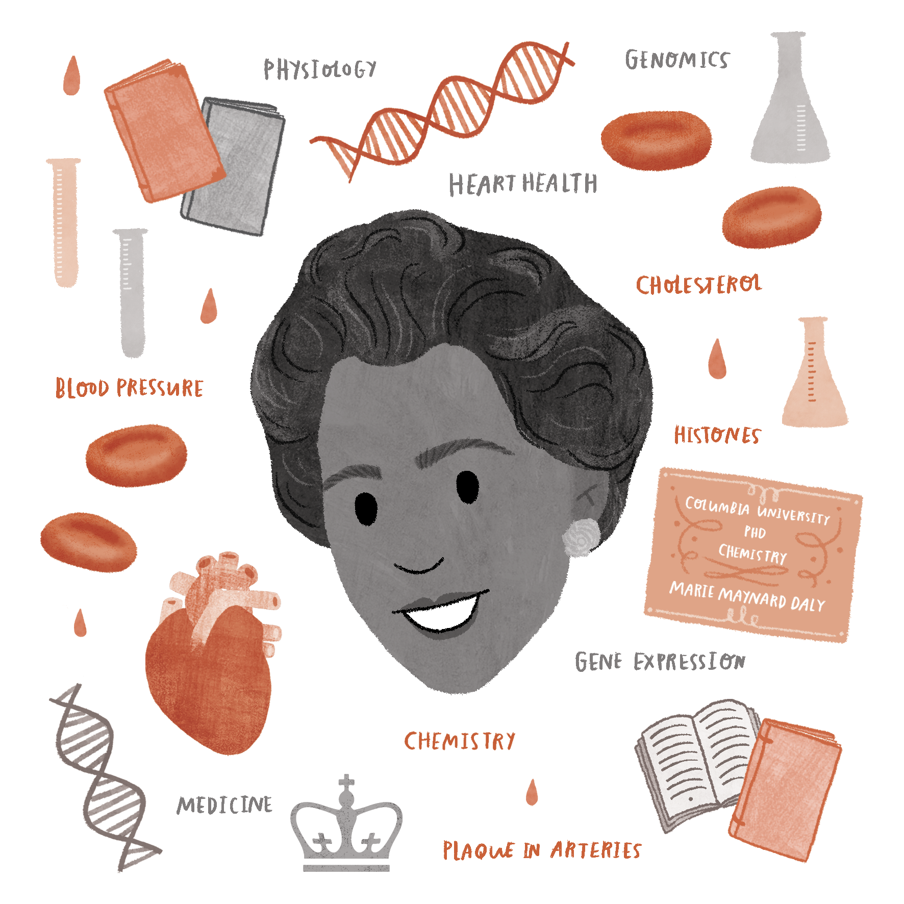
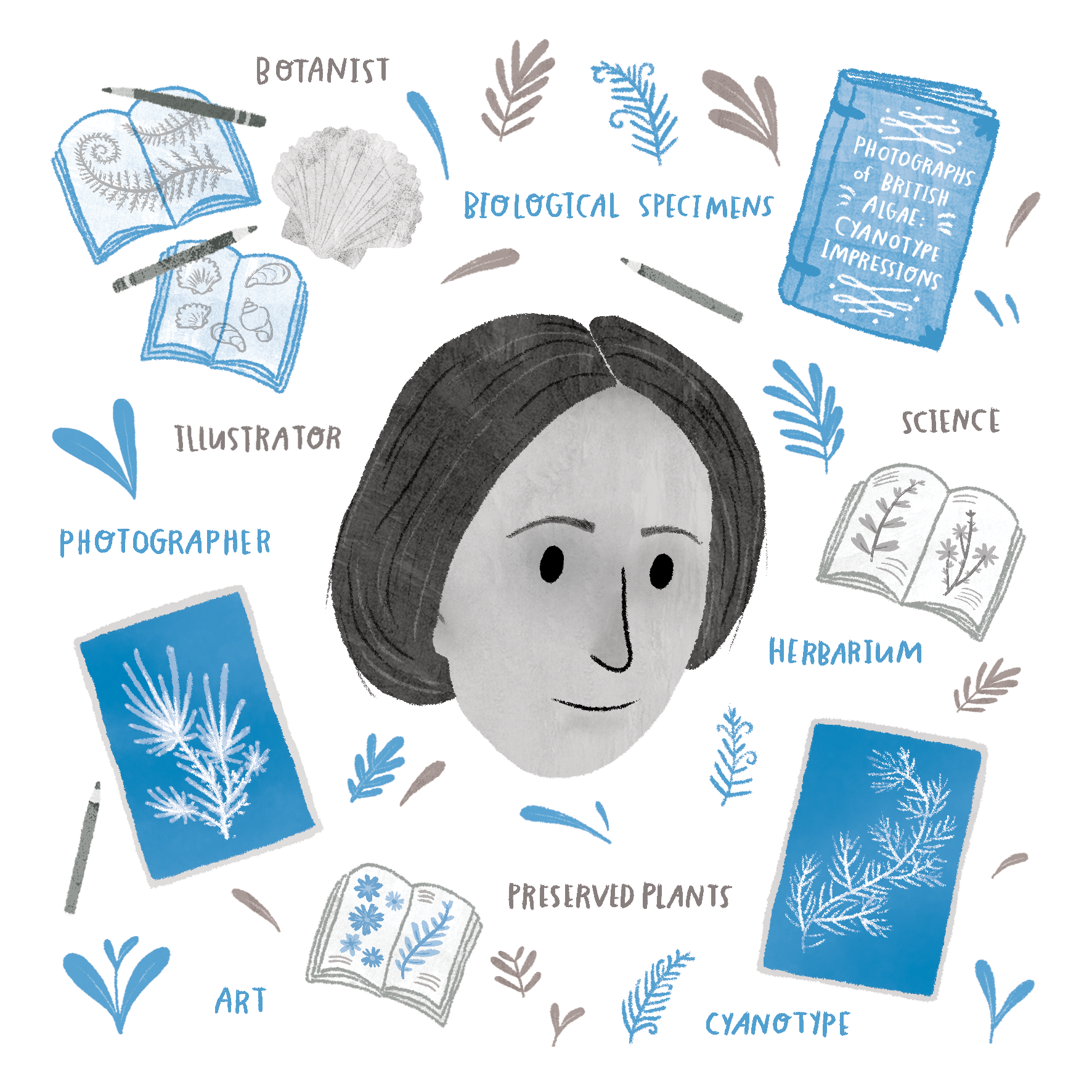
I often find that the best way to learn something is through looking at an example. There are countless fantastic examples of Data Viz across the internet – you can see a great roundup on this Medium article or on the Data Viz Society Instagram page. But it’s sometimes best to see an example that is close to home.
On that note, we polled the Lifeology community on our Slack workspace to gather some data for us to visualize. The following is a Data Viz snapshot of the Lifeology community on Slack, visualized with help from Lifeology member Molly Patton:


Figure 4: Data Viz snapshot of the Lifeology community. Illustrated by Molly Patton.

References:
Karen J. Murchie, Dylan Diomede, and Marie-Claire Shanahan. Fundamentals of graphic design—essential tools for effective visual science communication. FACETS. 5(1): 409-422. https://doi.org/10.1139/facets-2018-0049