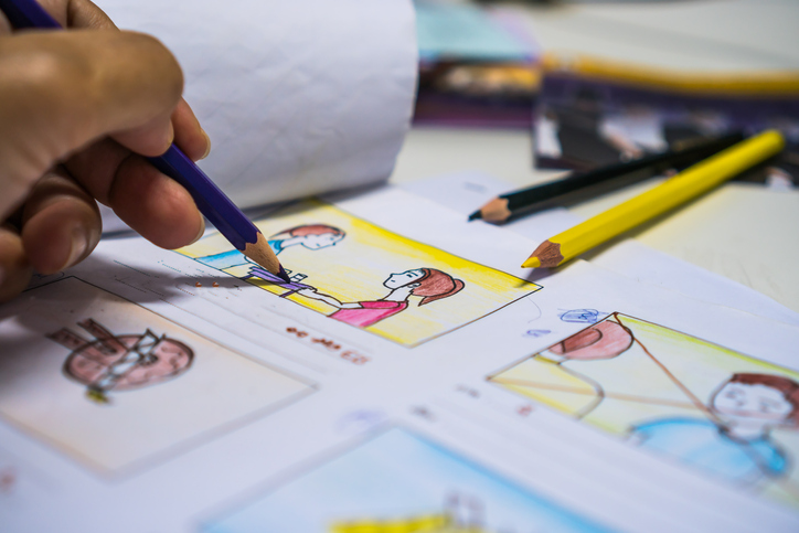
Hi everyone! I am Daisy, a science visual communicator, illustrator and ex-graphics editor at National Geographic. I am passionate about promoting accessible science learning by creating engaging visuals, and am excited to contribute my SciViz expertise to the Lifeology community!

Tell us a bit more about yourself! How did you get into art?
From an early age, I have always enjoyed doing art, from scribbling on blank walls to making art crafts out of recyclables. To me, it was an outlet to freely express myself. It was my childhood in New Zealand where my fascination with nature grew. I saw the connection of art and nature from children’s books by Beatrix Potter, and discovered the career of science illustration as I dug deeper for the true heroes behind those beautifully illustrated science textbooks.

Kiwi by Daisy Chung
What are your favorite things to illustrate?
I am fascinated by how our world works, and what processes form the beautiful balance of nature. Thus, I love illustrating anything in the natural world (especially strange-looking plants!) and using visuals to explain biological processes. Recently, my illustration work focuses more on environmental topics, as I believe art is a great way to inspire action in urgent times.

Stinky Plants by Daisy Chung
What art formats do you work with? Can you provide some examples?
I was trained as a traditional science illustrator at the Cal State University Science Illustration Graduate Program, and have a great fondness of traditional media especially watercolor. My recent work has been a blend of traditional and digital, blending base art rendered in graphite or watercolor with digital painting and information design.
You can see more of my work at: daisychung.com

Tentacles by Daisy Chung
Can you describe what your creative process usually looks like? Where do you draw inspiration? What tools do you use?
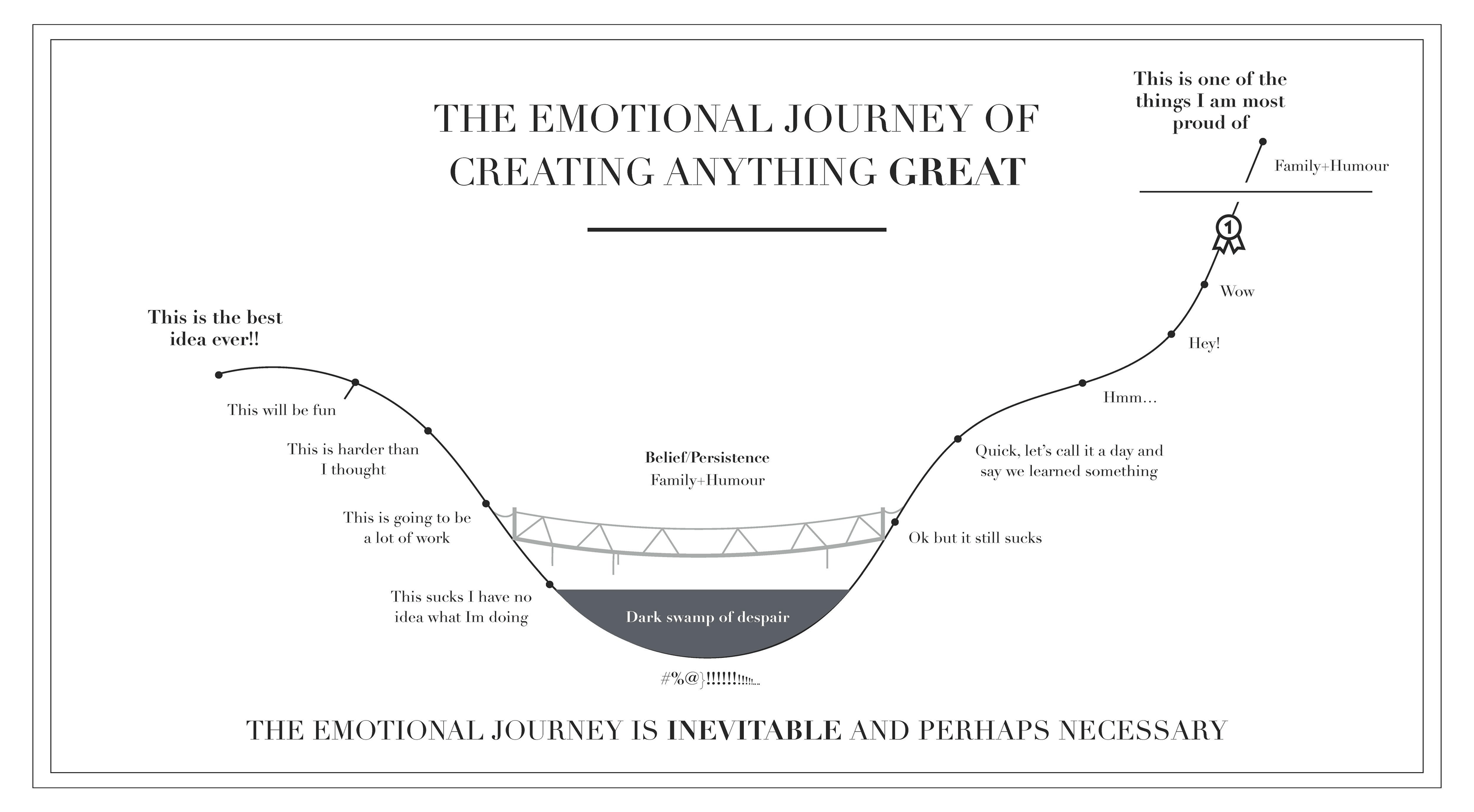
In short, it looks like this:

Infographic – The Emotional Journey Of Creativity
But to elaborate, to me a successful information graphic must distill complex information to engage stories that targets your specific audience, whether it is the general public or academics. Hence, my first step always is to fully understand the needs of my audience, then gather as much research information to fully understand the topic and become an expert myself. Then, I identify the primary elements/story I want to communicate, and several secondary elements (data, charting, interesting facts,etc) to support the narrative.
“My first step always is to fully understand the needs of my audience, then […] fully understand the topic and become an expert myself.” – Daisy Chung
Oftentimes, only 5-10% of the preliminary research I do makes it to the final design, which may seem to others like invisible time-wasted work. But to me, if you don’t understand the full story of the topic, your visual reporting would not be deep and meaningful. These crucial moments kick-start the work of solving the visual puzzle of information design for the given platform, whether it is a magazine, digital news or poster. The final art rendering is actually the easy and most rewarding part as you finally see everything slowly coming together!
I always start with pencil and paper! It allows me to be a bit braver than drawing perfect lines on the computer. I then use a mix of traditional tools and digital software, mostly Photoshop for art polishing and illustrator for putting the design together.

Development of infographic about Metamorphosis from sketch to final graphic
When you are getting started with a new science art project, what is the first thing you do? How do you get your inspiration? What are your first considerations / questions?
First thing… I do extensive creative googling on the topic to see what visual reporting is out there. With preliminary understanding, I ask myself what I can bring to elevate and add to the understanding of the topic with powerful visuals.
What am I most curious about? As science visual artists, oftentimes we delve in the research too much that we forget what it feels like to not know anything about the subject, and become too removed to our audience. The beginning is the best time to remind ourselves of the basic questions to answer and to create work that advocates for our readers.
I get much of my inspiration from flipping through award-winning graphics from SND, Malofiej, my colleagues as well as other news media. Here’s a great list of books to draw inspiration from.
What has been your favorite science art project to create so far? Can you tell us a bit more about it?
My favorite project is the recent data-driven story I worked on for Earth Week.
It’s about the massive seed collection efforts of scientists and the public in Hawaii to help save their most important sacred tree, ’ōhi’a. The effort is in response to the Rapid ʻŌhiʻa Death (ROD) crisis, a fungal disease destroying thousands of Hawaii’s endemic ‘Ōhi‘a trees, the backbone of its native forests (85% biomass) and watersheds. It’s an important story and urgent crisis that I came across during a journalism program at the National Tropical Botanical Garden in Kauai. Yet, very few know about it outside of Hawaii. ROD specialist and writer, Kim Rogers, and I have been searching for ways to share the story for over a year, and our efforts finally came to fruition with this publication on Nightingale. It was rewarding to work from an original idea, as well as collaborate with passionate experts and a huge data set to find the best way to visualize and to shed light on the issue more widely.

How ‘ōhi’a Die by Daisy Chung
How can scientists or others work with you? And what does a successful collaboration look like for you?
I am always excited to work on new topics and help find the best visual solution to communicate the amazing work you do!
To me, a successful collaboration is when visual ideas come from both the scientists and the artists, and both have the same goal for what to achieve with the visualization. I believe everyone is an artist at heart, and especially think that creative input coming from folks outside of the visual field is the most valuable, as they more closely reflect how your audience will respond to your art. If it doesn’t make sense to them, no matter how pretty you think it is, it won’t work!
You can reach me via email: daisyyanjuchung@gmail.com.
Can you talk a bit about visual storytelling, why it is important to you, and how you approach it?
Finding a story in visual reporting has always been the most crucial element of my work, as it brings in the human element that helps connect abstract or complicated information to your audience, and inspire them to care and spark conversations about the relevant subject.
What tips do you have for scientists wanting to work with artists or get into science art?
Communication and trust is key! If a scientist has never worked with an artist before, it may be hard to envision how visuals will help with your communication without being able to see it right away. But trust the artists’ professionalism and understand that creating successful visuals takes time beyond rendering the art. Don’t shy away from communicating your ideas along the way, give art critiques or even share sketches! In SciArt collaboration, scientists are also the creative director, as you know best your subject matter and audience, while the artists can use their expertise to realize your vision.
“In SciArt collaboration, scientists are also the creative director” – Daisy Chung

Neuron Cover Design by Daisy Chung.
This submission was a collaboration with Scientist Dr. Al La Spada, who provided a great idea sketch (left) and vision, of which I used to create the concept art (right).
What tips do you have for other science artists? For their careers or how to create visuals that broader audiences can relate to, enjoy, learn from etc.?
1. Be proactive in seeking collaboration opportunities! My initial collaborations started from advocating to faculty researchers about how visuals will help communicate science as an undergrad student at Rice University, and creating projects with these idea pitches! Until this day, I am still collaborating with them and am so excited to see science communication growing in the community.
2. Always be in the reader’s shoe when creating your work. Look at successful examples carefully to identify key elements that make it work, such as the design, the amount of visual and non visual information, the style or color usage. Share your work to your family and friends that don’t work in the creative field. For me, my software engineer husband has been my greatest art critic. If he doesn’t get it, then the visual explanation must need improvement!
Why should more scientists work with artists?
As most of us are visual learners, successful visual stories help to bridge audiences of all ages, backgrounds and interests with incredible science discoveries that may have otherwise only been circulated in the academic world. Especially in the current climate, when much scientific information faces furious opposition and doubt, it is even more vital for scientists to find successful ways to communicate information that engages with the public!
