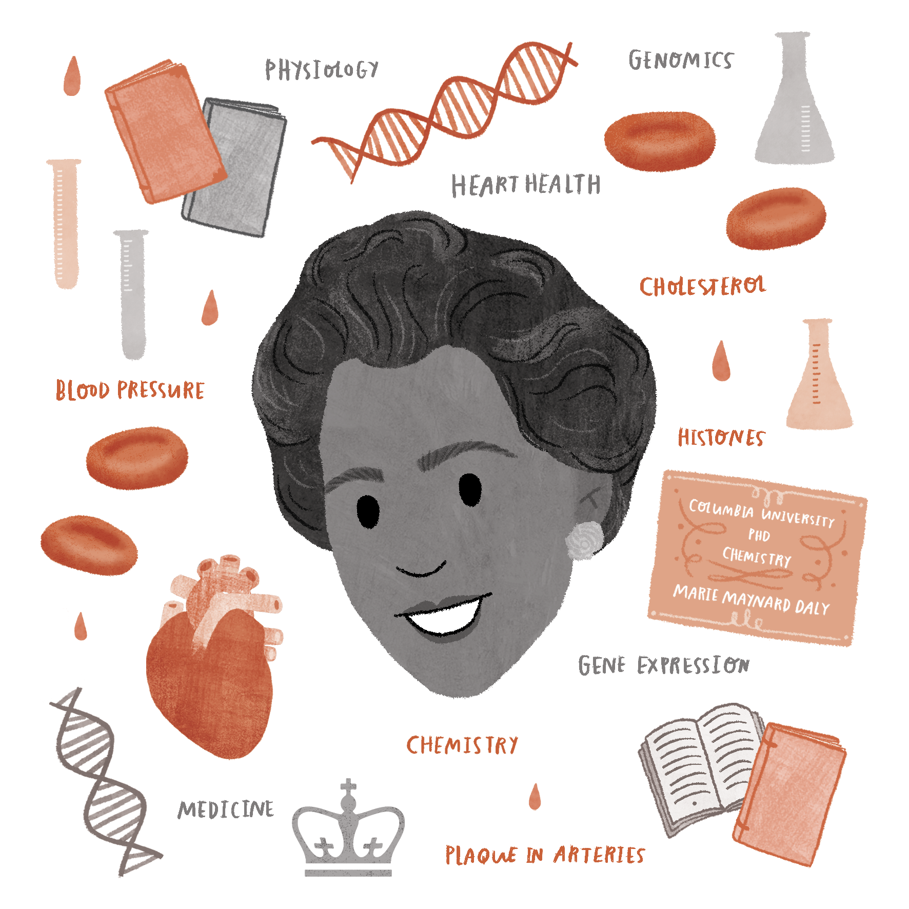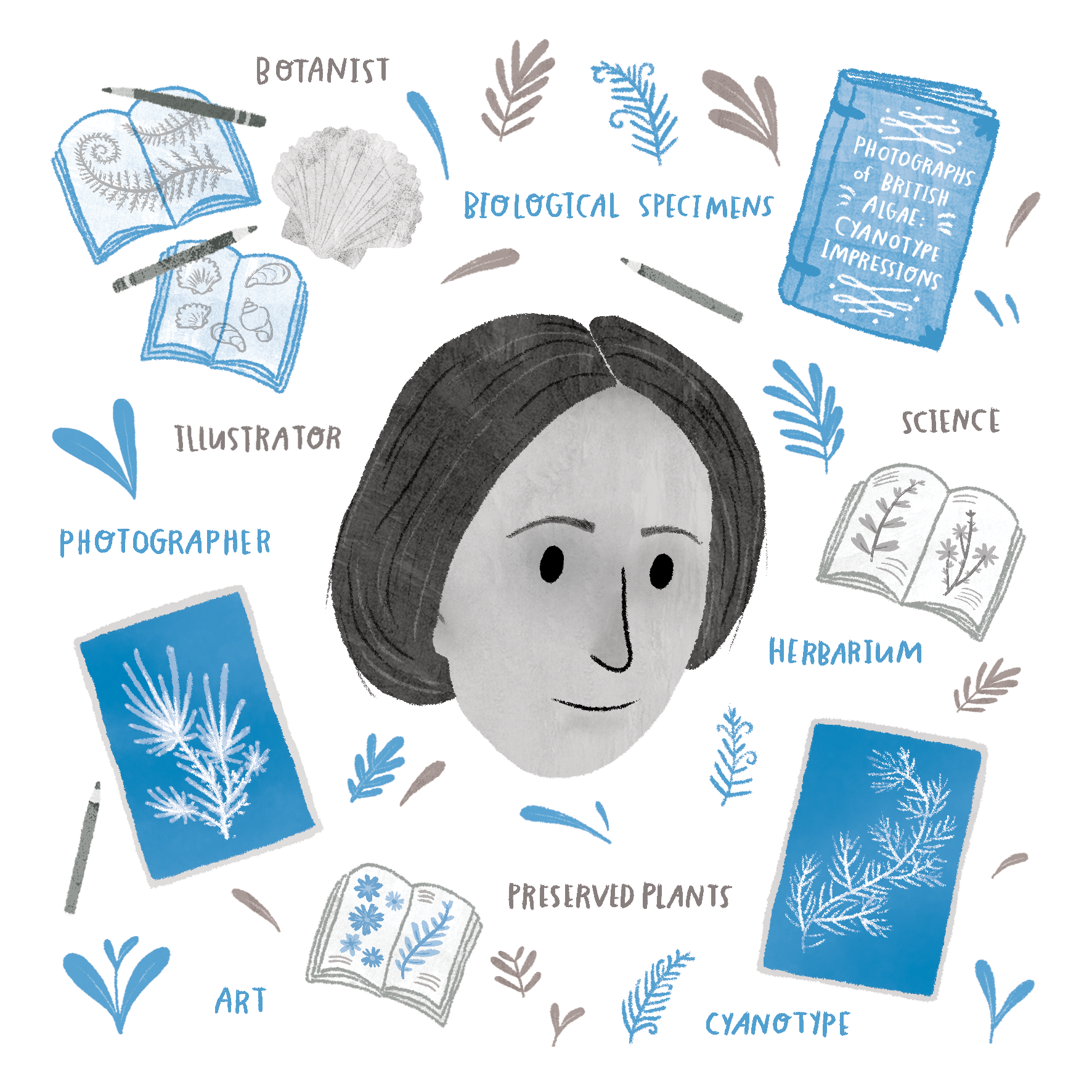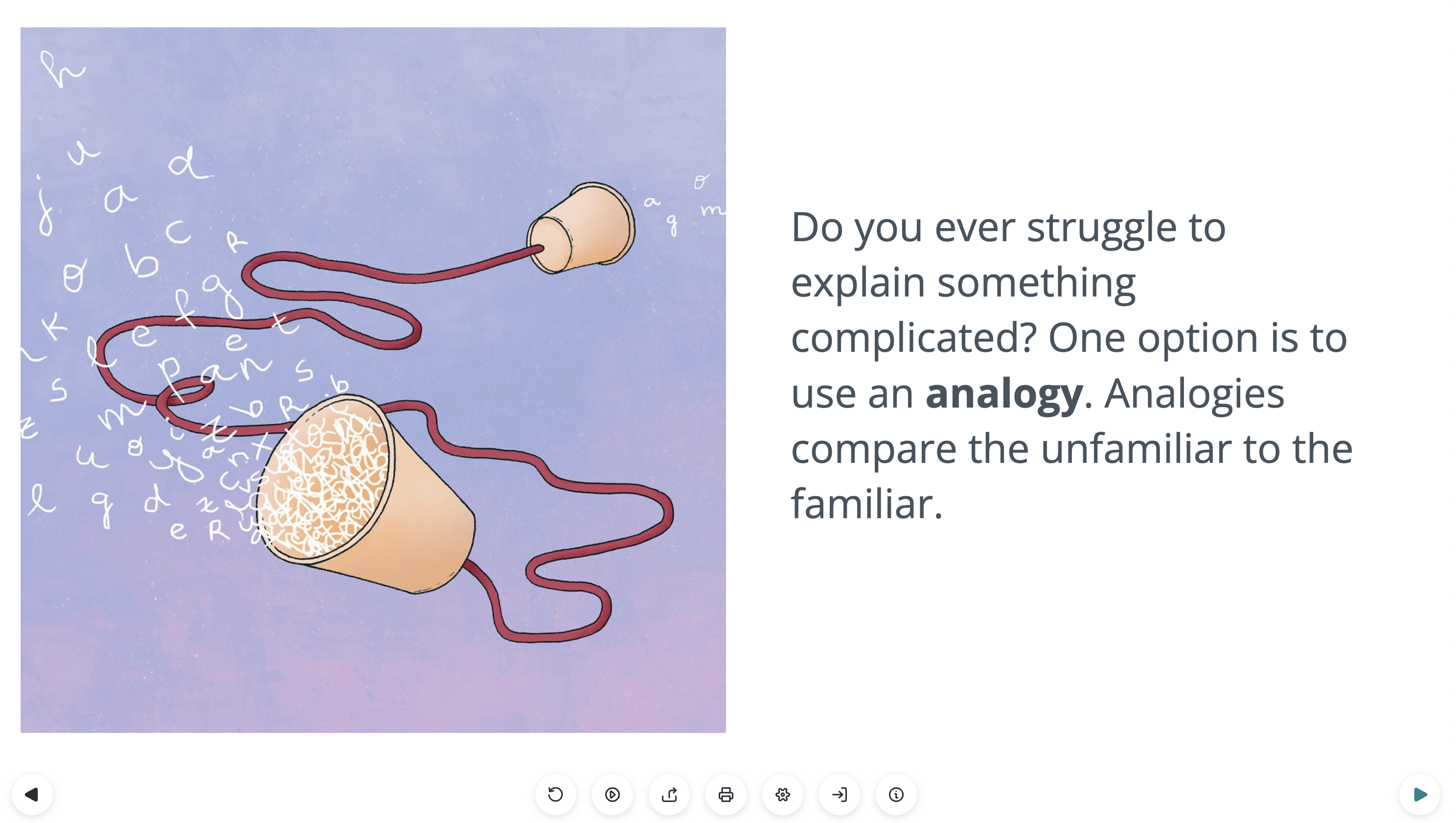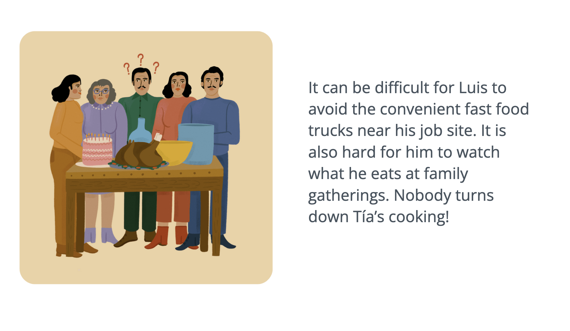
The Lifeology team has been busy working with health professionals, from mindfulness coaches to fitness experts to medical specialists. We have been creating a series of Lifeology courses for LIFE Ascent, a wellness program that gives subscribers the tools needed to improve their health. It is a program based on learning, measuring and establishing habits across multiple areas of health.
This blog features illustrator Matthew Griffiths, a South African-based creative content producer who is passionate about meaningful storytelling and visual media that positively impacts society.
Can you tell us a little about your background?
I’m a content creator and artist from Cape Town, South Africa. I’ve worked in film and media, running a content company for 10 years. I have a wide range of creative interests including writing, art, illustration, photography, motion design and film.
How did you initially find Lifeology?
I discovered Lifeology after creating a free COVID children’s book that was released online and translated into many different languages. Someone saw my book and other work and realised the Lifeology network would be a good fit for me!
Have you illustrated a Lifeology card deck before?
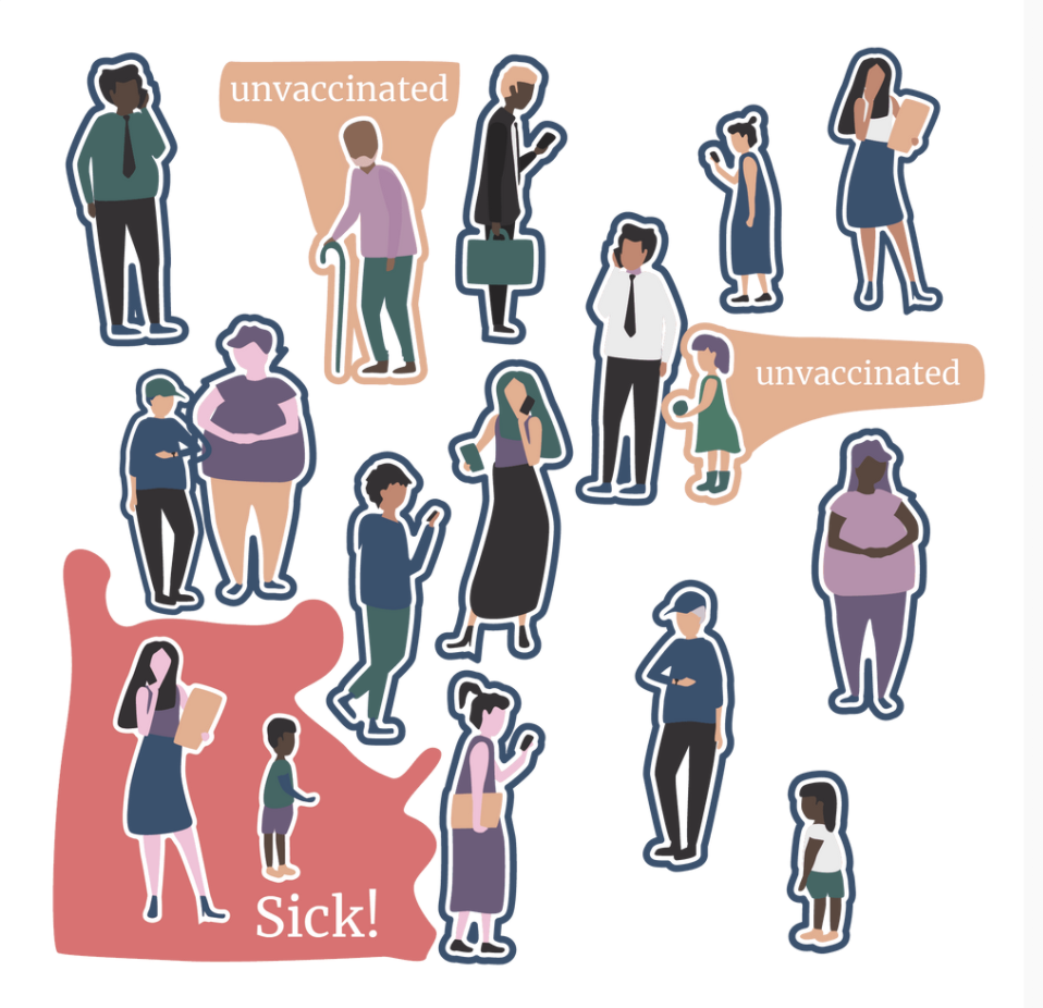
Yes, my first course was on Vaccines so I had a good idea of what was needed and how I could improve when I started this course.
Would you consider yourself a SciArtist?
SciArt is definitely an important part of what I do. The majority of my work is translating research into infographics and informative motion design videos. I’ve also worked on some great health projects that use creative stories to get across messaging instead of packaging it as information.
The course you illustrated was on metabolic health and the dangers of sugar. When looking at the course script, what were your initial impressions?
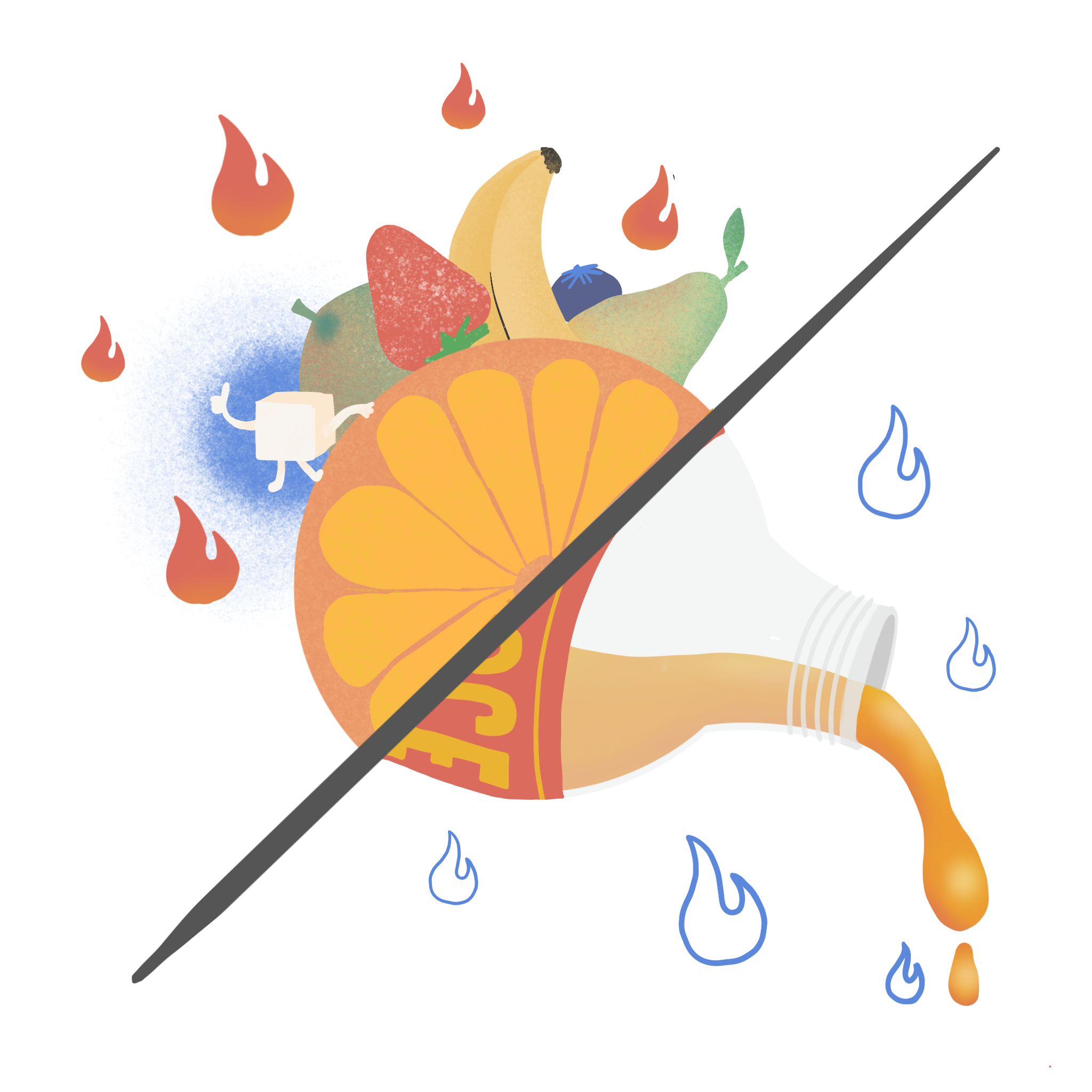
One of the biggest challenges with a project like this is envisioning the science in an understandable way. I spent quite a bit of time trying to figure out the best ways to show the different sugars and their effects. Some slides seemed to have a straightforward visual to strengthen the message but others took research and imagination.
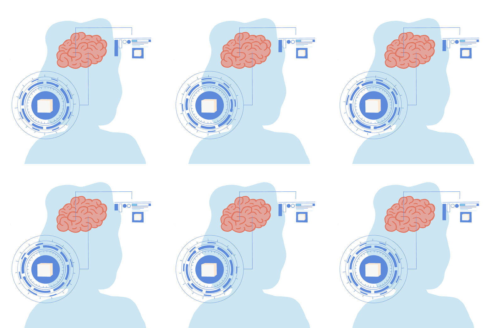
Are visual notes a useful starting point? Did you make any decisions to develop ideas further?
Visual notes are incredibly helpful. The scientists and researchers usually know more about the topic than the artists and having them guide visuals speeds up the process. I can then build on those ideas with my skillset to make the information more compelling and visually attractive instead of having to start from scratch or do lengthy research to understand the topic. Sometimes the notes don’t fit in with the other visuals or could be improved upon with visual metaphors but they always act as good foundations. A lot of the development I did was to try and keep a cohesive visual narrative going throughout the course which meant reimagining some of the notes or adding to them.
Do you use storyboarding in other work?
I use storyboarding in a few different mediums, especially for film, motion graphics and story books. It helps to figure out a cohesive story and composition before actually getting started. I also find mood boarding incredibly helpful, this focuses more on the style and different iconography or images through gathering references, colours and ideas together. Reference images are often the most informative as someone has almost always tackled a topic before. In this way one can look at improving on what’s gone before and have an idea of what has worked for other projects.
Can you tell us a little more about how you get from visual idea to storyboard image to final rendered piece?
For me the visual idea is key. The hardest part of SciArt (for me) is figuring out the best way to communicate the message to an audience, which is why I find receiving help from the scientist and understanding the research so integral. Once we’ve figured out the idea I also look at a mechanism that can run through the whole narrative to keep it cohesive. For example: one can’t switch metaphors or it becomes hard to follow the visual idea.
Mood boards and reference images help to lock down these visual ideas and decide on a style and color scheme for the project.
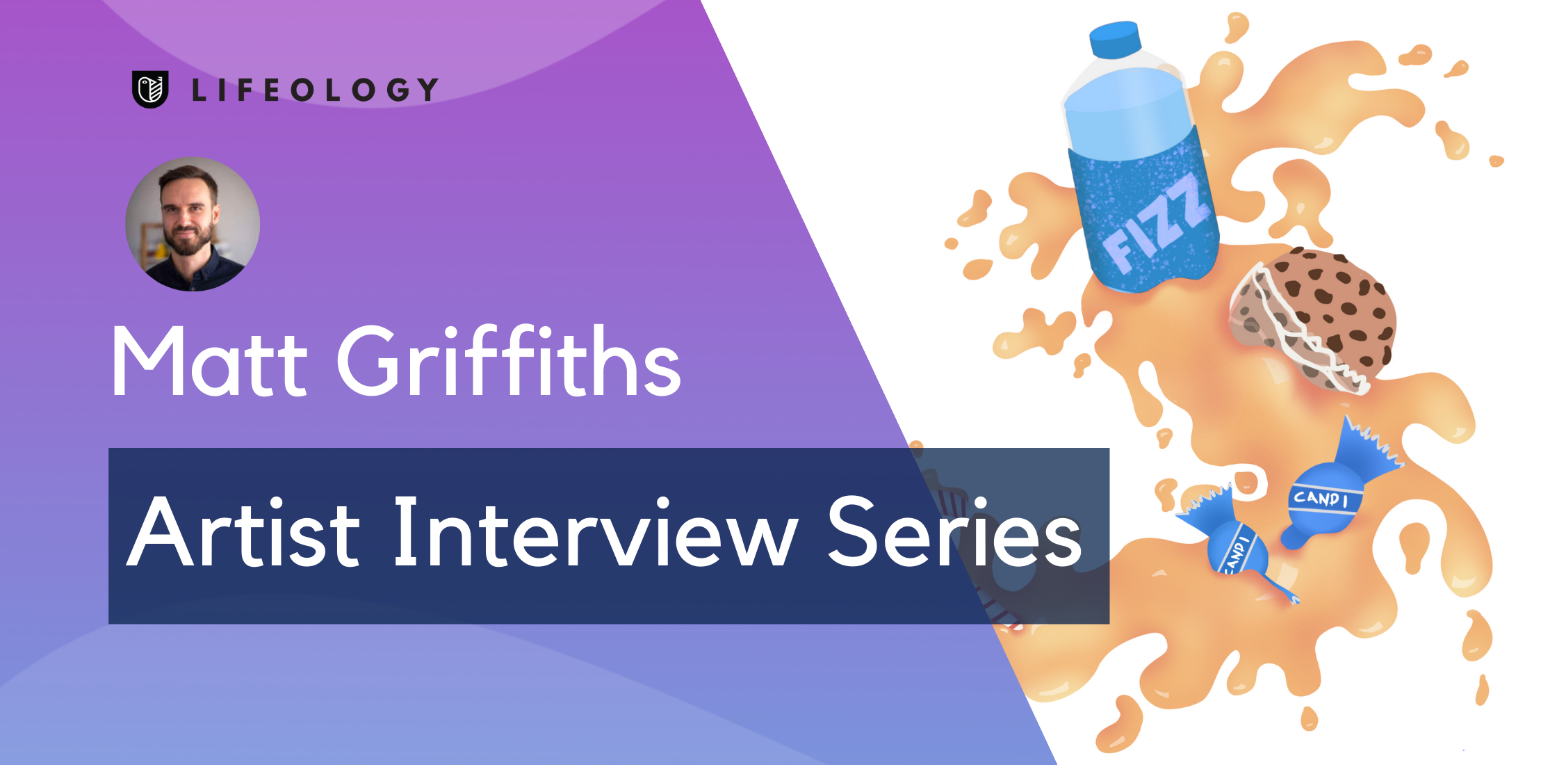
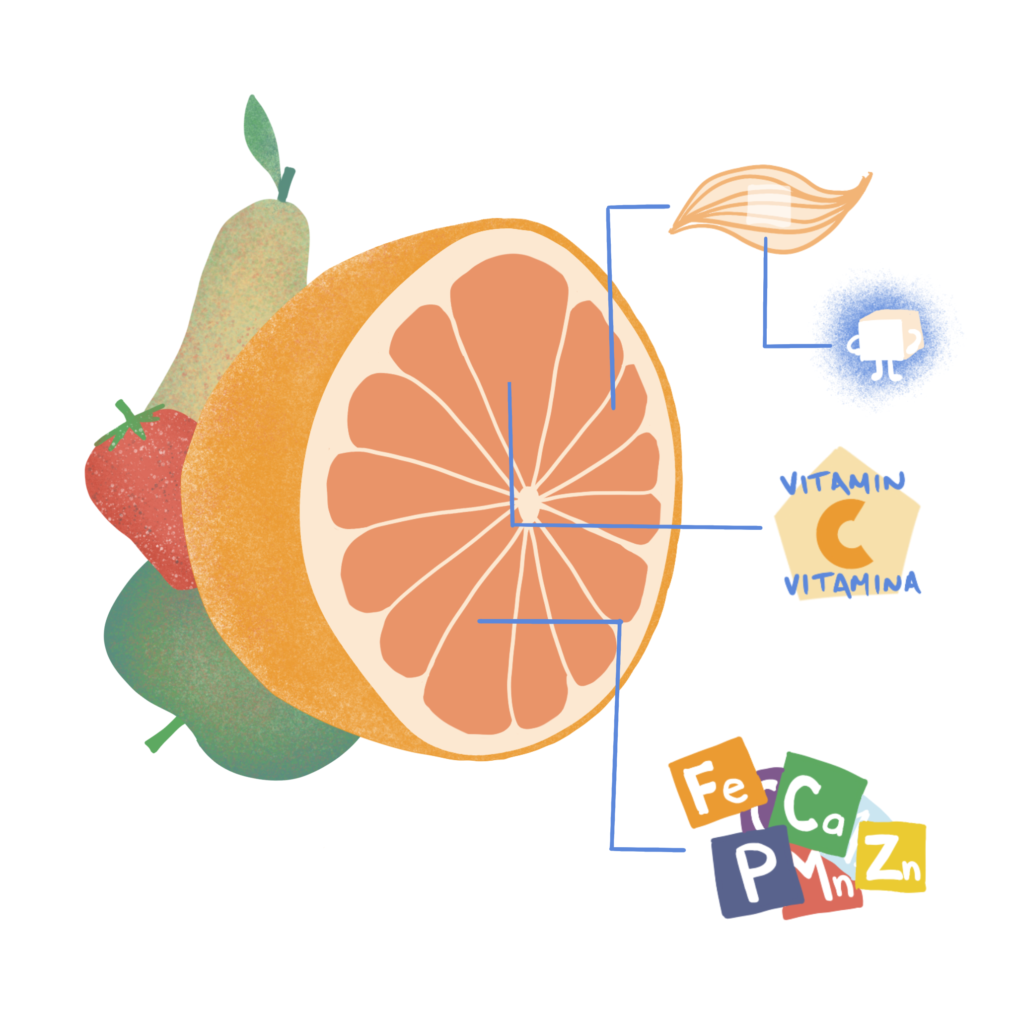
From here storyboarding is just a matter of figuring out the composition and details of an image. In this case, we wanted to show that fruits were more than just sugar. The sugars are inside fibre and there’s the added benefits of vitamins and minerals, in contrast to the empty calories of fructose filled sugar drinks or candy seen in previous slides.
Finally, the fun and rewarding part you see, is when the image comes together in the style and color scheme. Here it’s just about adding detail, figuring out small issues of composition and color and making sure it looks good.
With my motion graphic skills I also chose to turn some of the images into GIFs – I think the added motion helps to grab viewers especially in the modern age where everything is competing for our attention. For this I import the layered image into Adobe After Effects where I can control all the motion elements.
A timelapse video showing Matt’s process
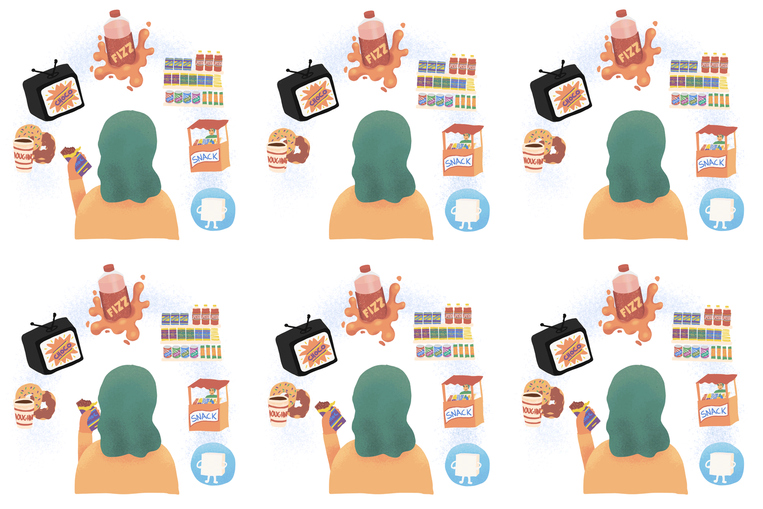
But we live in a different world now, one where sugary treats are around every corner. Our evolved desire for sweet taste leads us to sugar overconsumption.
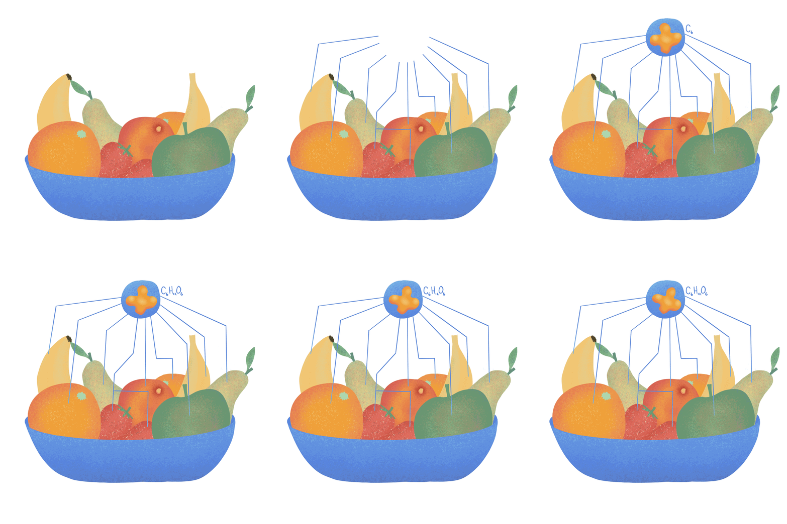
Fructose is the sugar naturally found in fruit. Fructose has been part of the human diet for ages, but only in small amounts and in the form of whole fruits, which have many health benefits.
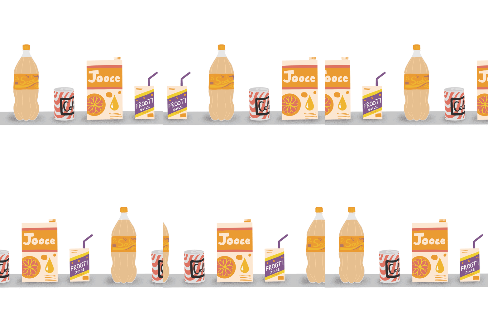
About 75% of all store-bought foods and drinks contain added sugar in some form. The biggest culprits are sugar-sweetened drinks like soda and fruit juice.
What are your illustration tools of choice and why? Any recommendations to those starting out?
I work in a variety of mediums including pen, paint and PC. I do most of my work in Illustrator, it’s a powerful tool but it’s also quite complex. For this course, I worked in Procreate on iPad as I wanted to have the use of brush and texture and move away from the hard vectors I use for infographics.
If you’re starting out I’d recommend trying as many different mediums as possible, at the end of the day it’s not really about the tool but about how you use it, so figuring out what you enjoy working in is important. I’ve done a LOT of free tutorials and classes in different mediums and continue to do so when I have down time to keep learning and trying new things.
Did you learn anything from your course illustration? About your artwork, health info or otherwise?
I always learn new things on SciArt projects which is a great bonus of the work. I have to get involved in the research in order to do my job properly because if I don’t understand the information in detail I can’t visualise it for an audience. In this case I had the added learning of doing my first paid work in Procreate which involved a lot of new art learning on top of the health information I gained!
Anything that surprised you?
I was impressed with how far iPad technology has come in terms of producing professional work as it was my first time using it as my main tool. I also really enjoyed interacting with the team, learning some new things and contributing to better health understanding.
Tell us a little more about your other types of Art. Do you sell art?
I write and draw children’s books. I’m working on getting published and doing more work communicating science and life lessons to children. I also paint fine art which I sell (when I’m lucky) on instagram @mattcgriffiths

Matthew Griffiths is a creative content producer, passionate about meaningful storytelling and visual media that impacts society positively. Most recently he created The Inside Book to help children understand COVID-19 and lockdowns.
Instagram account: @mattcgriffiths
Twitter account: @mattcgriffiths
Website: https://mattcgriffiths.com/
