Lifeology community member Laerie McNeil walks us through her submission for this month’s DataViz SciComm Challenge! Laerie is a student in Science Communication at Laurentian University, Canada. She has a background in environmental microbiology and has always been interested in animation, cartoons and fiction translation.
Can you talk us through your process?
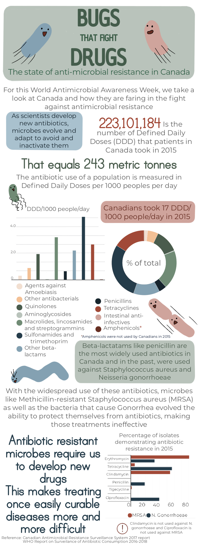
I started off the process by deciding what kind of story I wanted to tell. Because of my microbiology background and my fondness for drawing bacteria, I chose the anti-microbial use data. We were provided with large datasets and it wouldn’t be feasible to try and express all of it, but a snapshot of all of the data would be too general. I decided to focus in on Canada and their use of antibiotics. I took out the information and designed a narrative that would make sense.
Was it challenging to turn the information into a visual format?
I do most of my projects in a combination of Procreate and Pixelmator. I chose a colour palette that I liked, using coolors.co, and got to work designing my layout. I tend to prefer a cooler palate and am drawn towards blues, and so I chose colours that complimented those. It was important too that I selected colours that could be differentiated by those with vision impairments, and coolors.co has a handy tool for that.
I drafted the graphs in excel and then imported them and tweaked their design.
I bounced back and forth between a few different types of graphs, but opted for a more simple combination of bar and doughnut charts. I had originally decided to combine three variables in one graph but decided against it, as it made the data less intuitive to understand.
By using a doughy chart, I was able to demonstrate relative use of each antibiotic without crowding in too much unnecessary information. No one needed to know what percentage points penicillin represented, only that it makes up a large portion of antibiotics that Canadians use.
I opted for another bar graph on the bottom, as I was dealing with simple data, but went with a horizontal layout as the antibiotic names were quite long and would lead to awkward squished text if it had been on the bottom. I didn’t want to make people turn their head 90 degrees in order to understand what was going on.
Can you tell us a little about the tools you used?
Other programs that allow more freedom in shape making as well as illustration tools would have probably made the process quicker, but I like the ability to hand draw my elements, and so I opted to compose the whole thing in Procreate, using Pixelmator for resizing and cutting only. I placed my first graphs and laid the text around them until I was happy with the arrangement.
I came back to the title many times and went through many iterations in the process. I didn’t want it to come off too wordy or dense, since it was comparatively text heavy and so I alternated text sizes and colour in order to break up the monotony and highlight important points.
After everything had been set in place, I continued to recreate the title until it meshed with the feeling I was going for. Finally, I added in the little bacteria guys, as I always prefer a cute character to add a little fun into (what some may perceive as) boring data.
Did you find the task challenging?
The challenge was really fun and a good way to test out all of the things I have learned up until this point in a unified project.
There is still time to take part in this month’s DataViz SciComm Challenge. Take part and you can win a 1:1 Design Consult with Lifeomic’s VP of Design!


