In this post, climate change communicator Lydia Messling shares with us the creative process behind her infographic for the June SciComm Challenge!
About me: I work as a climate change communications consultant and help explain climate change to a wide range of audiences, and also train climate scientists in doing the same. I ended up working in science communication when I did my undergrad in Environmental Science at UEA. I quickly realised that communicating climate change is something that is really needed! After working in behavioral change for a couple of years, I then went back to university as a Leverhulme Doctoral Scholar in Climate Justice at the University of Reading, where my thesis was on ‘How can climate scientists engage in policy advocacy and preserve their scientific credibility and independence?’.
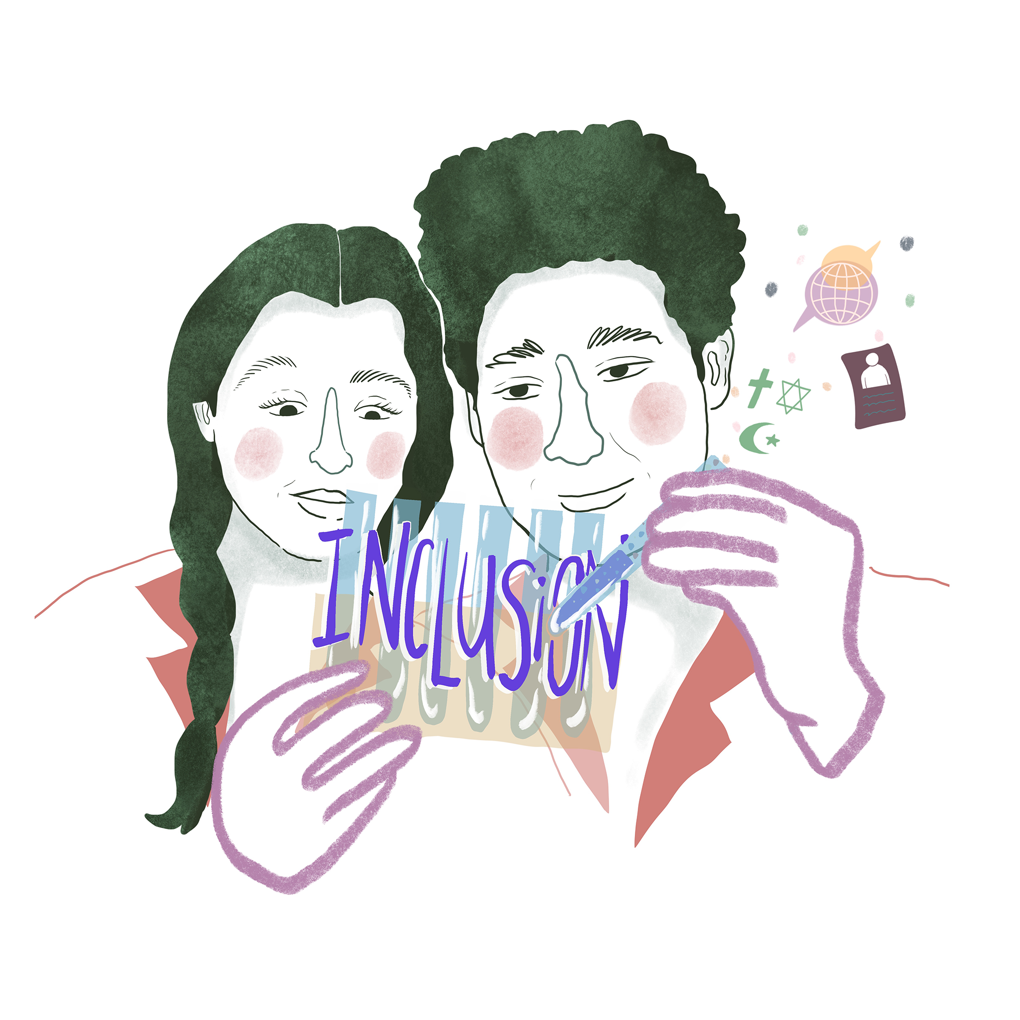
Communicating Climate Change
Language is really important, and communicating uncertainties, particularly around climate change, is really difficult. For scientists, trying to explain the “so that then means…” of climate change can sometimes feel like they’re wandering outside of their expertise – they find it’s safer to use these defined terms to stipulate uncertainties and to accurately portray confidence levels. But these words have completely different meanings to your Average Joe. So I decided to make an infographic to explain these terms and the special way that scientists use them.
We know that some of the most important things about communicating climate change to different audiences is to engage with their values, to tell a human story, and to talk about real world examples (see this handy set of principles for climate scientists doing public engagement). So when I was doing this infographic, I wanted to help show the scientist-humans and their thought processes behind using these words, and relate them to other ‘real world’ examples that people might understand.
First off, I split the infographic in half to separate out Confidence levels from Likelihood, as this fundamental difference is important to make clear. However, I kept the main IPCC quote about the world’s warming in the middle:
“Global warming is likely to reach 1.5°C between 2030 and 2052 if it continues to increase at the current rate (high confidence)” – IPCC Special Report on Global Warming”

This is symbolic of everything coming together and forming the main message in the middle. It also means that you can get a really quick abbreviated message by scanning the information right through the middle of the picture.
For the sides of the infographic, the information is organised so that the main ‘conceptual text’ is at the top, followed by an explainer paragraph and some pop-out explainers. Then, the tables provide the synthesis of the technical information with real-world cases. I also tried to vary the writing size to help people pick out the main points.

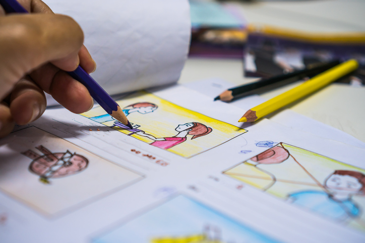
And then I started writing. It maybe looks a bit rough and scraggy in places, and it’s got more words written on it than I had first intended, but I felt that there was something more engaging and warmer about seeing my handwriting than using a text font. Wonky hand drawn lines also make it seem more conversational than straight ruler lines. Handwriting is a really personal thing, and talking about language and trying to show the human-process behind making these scientific statements seemed to help emphasize this. By keeping it as my handwriting, I think it helps the audience to hear the human behind the explanation and helps to show how risk and uncertainty are actually familiar, everyday, and personal things.
I wanted to make sure that the examples I used to illustrate the definitions were events or things that most people will be able to identify with (there’s also a bit of British humor in there, so that may limit the audience a bit!). A few little drawings help to break up the text, and the colors for these are bolder to represent how they are real-life things. They’re also small so that they don’t dominate, and encourage people to zoom in to read the detail so as to understand why, for example, a cat is there. The rest of the colour palette is in pastels – to reflect that these are wispy, hard-to-get-your-head-around concepts. And the overall colour usage is very simple to reiterate that these don’t need to be super-complex science things – they can be very simple concepts that we use all the time.
Full Infographic: