Communicating complex ideas to a young audience can be challenging. Kids have their own unique ways of understanding the world. By creating art that connects with them, they can feel encouraged and empowered to discover and learn.
Why is it important to reach learners while they are young?
Reaching young learners in a variety of media can improve their overall educational outlook.
“Research conducted around the world suggests that good-quality media products produced for children (television and radio programmes, books, Internet sites, mobile phone information services, public-education street-sign campaigns, puppet shows, dramas, etc.), can be effective in promoting a host of development goals. For example, educational television has been proven to encourage school preparedness among preschoolers, to encourage early literacy and to teach specific school curricula effectively.”
-UNICEF, Communicating with Children, Barbara Kolucki, MA Dafna Lemish, PhD
Connecting with children visually is easier at an early age than in their teens or later. The more they care about science and art now, the more likely they are to be interested in pursuing educational opportunities and careers in those fields later in life. You don’t pursue the opportunities you don’t know are possible. Just like you can’t develop interests that you don’t have access to. I personally remember a few books, museum visits, shows, and movies that were particularly impactful and started me down the career path that I am on today. I’m sure you could all point to something in your past that ignited the spark of your future career.
How can art help to engage young learners in science?
Let’s look at some examples!
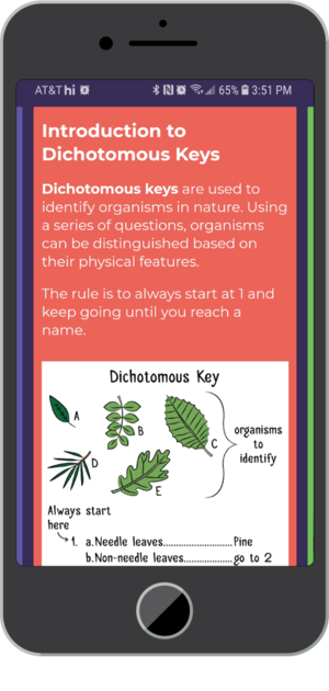
Illustration from “Socratic – Homework answers and explanations” educational mobile app, showing how illustrations can illuminate key concepts in complex ideas.
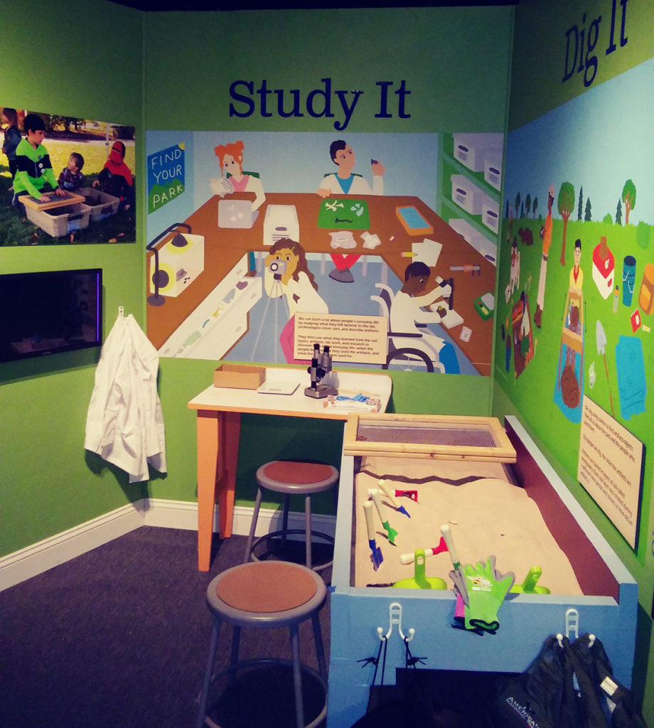
Rome NY Historical Society children’s archaeology exhibit showing a diverse group of kids participating in lab and field archaeological techniques. In this exhibit, the knowledge learned throughout the museum can be practically applied here.
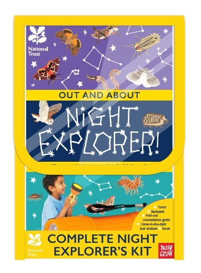
The National Trust’s Complete Night Explorer’s Kit. The kit includes a fact book about nocturnal UK wildlife, star maps, stickers, and a flashlight in a backpack. This kit allows kids to learn about local UK wildlife and then gives them the gear to go explore it for themselves.
In all 3 of these examples, illustrations are used in conjunction with text and other elements to more deeply explain and reinforce the concepts that are being taught.
Below I’ve highlighted some visual techniques and other methods that you can use to reach young learners.
1. Accessibility
- Create work the meets your audience on their level. You want to speak to them, not down to them.
- Depending on the subject matter, bright colors and simple shapes can often be used to make the subject more easily understandable.
- When showing people, diversity is key. You want everyone viewing your work to feel welcome.
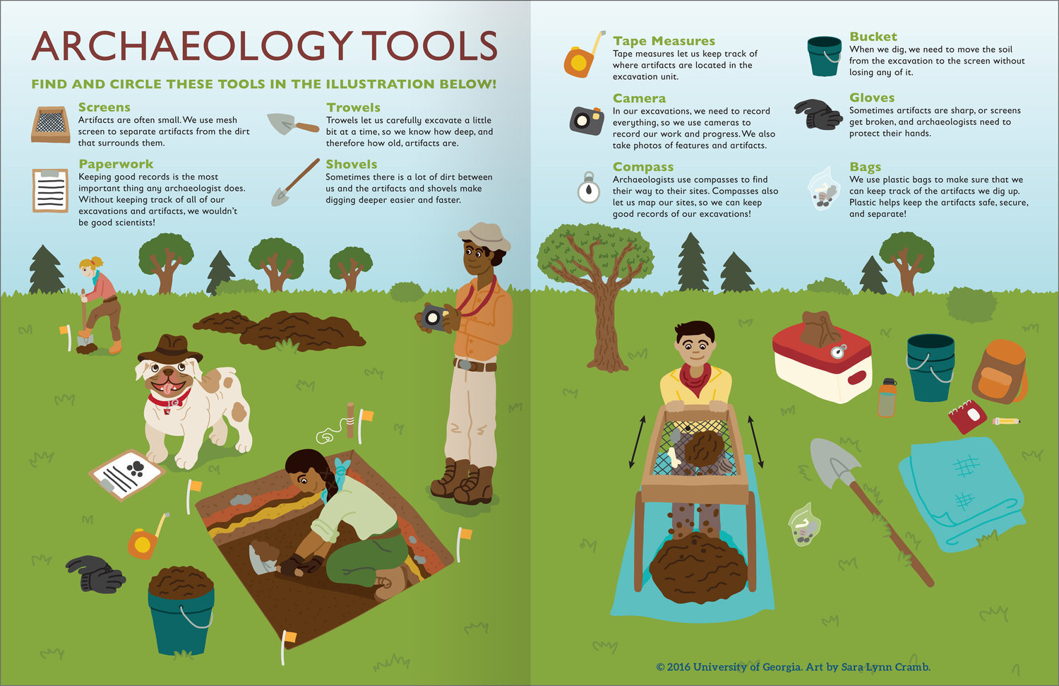
This illustration, created for the University of Georgia’s Junior Archaeologist Workbook, shows various tools used in the field while at an archaeological dig. Bright colors are used to draw attention to and differentiate, the different objects. The people in the illustration are diverse in both their race and gender, encouraging inclusivity. A bit of interactivity was included in this illustration, as well as others in the workbook, in the form of a search and find, which in addition to teaching children about the role each tool has to play in fieldwork, also reinforces their learning in the form of a game.
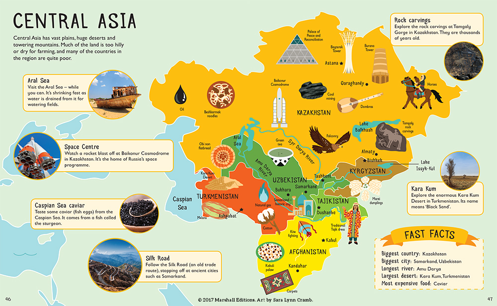
This illustration is from a world atlas book illustrated for Marshall Editions. Each continent was broken up into sections and the culture of the people of that area were highlighted in the text, photos, and illustrations. The text was broken down into easy to understand chunks by the author, and I created maps with enough detail to help kids understand the shape of the continents and countries and the cultural elements scattered across the map in specific locations. Bright colors and bold silhouettes were used throughout the book to maintain a lively tone to encourage engagement with other cultures.
2. Simplicity
- Break down visual information into simple, easily-digestible forms in order to appeal to young learners.
- Include enough detail to be accurate, but not so much that it clouds the message.
- Eliminate unnecessary details.
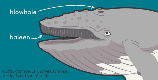
Detailed wildlife illustrations are a thing of beauty, but may not be as practical as more simple illustrations when teaching the very young about things like basic anatomy, for example. In this illustration created for Cambridge University Press, a humpback whale is pictured. Enough detail is included to show that this is, in fact, a whale, with not so much detail that it distracts you from the parts of the anatomy that needed to be labeled. I often wrestle with the balance of including enough information to accurately and succinctly display the information needed in the illustration without including unnecessary details that could be distracting, especially to very young learners. I don’t want my subjects to completely lose character or personality though, so I don’t want to eliminate too much to the point when the illustration is uninteresting to look at.
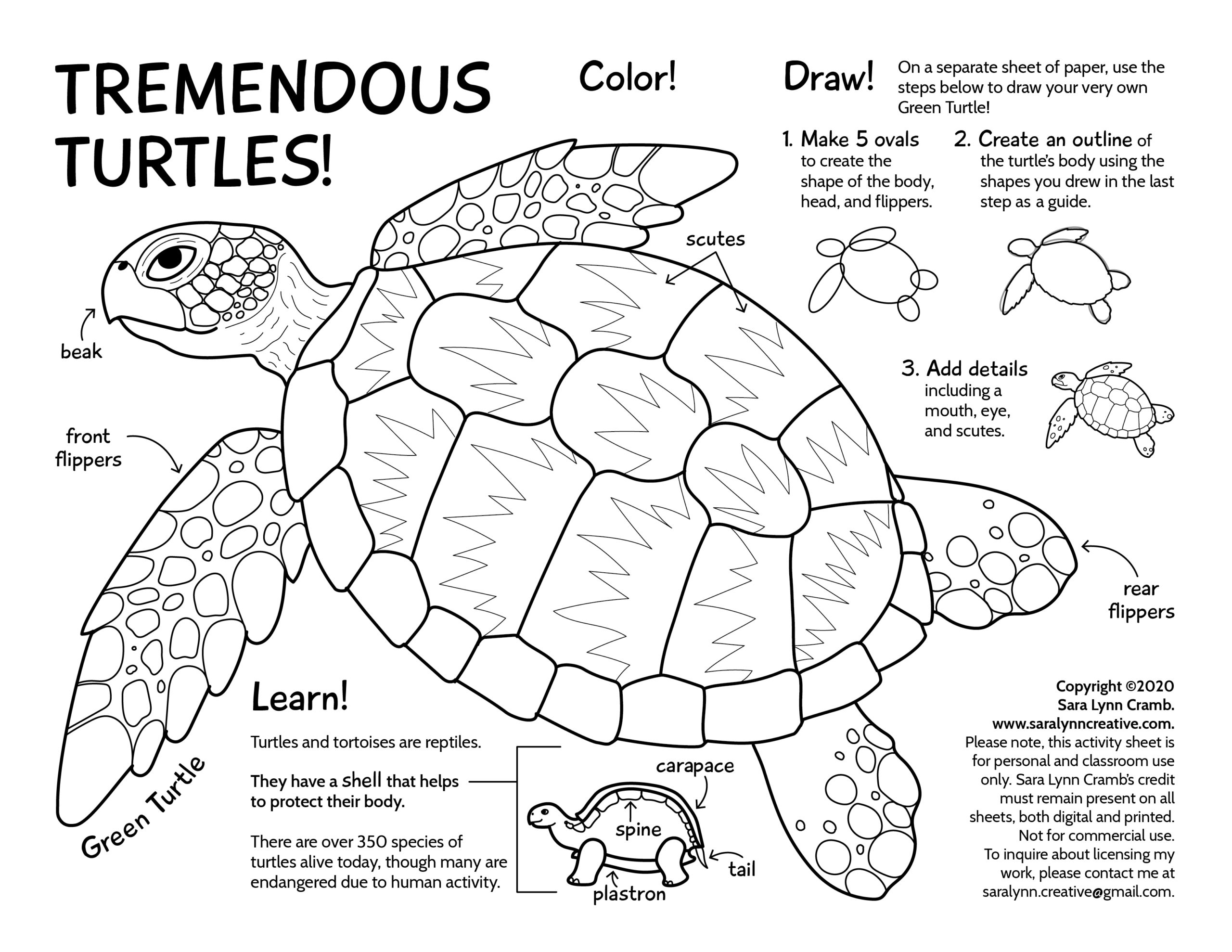
In this turtle coloring page I identify some of the main components of the turtle’s anatomy to help kids understand the basics of the body parts. This, and the other coloring pages I create, are centered on a different theme each month. The pages combine line art illustrations that can be colored in with facts about the animal(s), and occasionally I include additional opportunities for artistic expression with learn-to-draw activities. These coloring pages combine artistic practice with interesting facts in a way that encourages learning and creativity.
3. Play
- Playful rendering, characters, and character interactions can make your subject more memorable. They can encourage the attachment of emotion to a subject, which can make it more meaningful to your audience.
- Humor can ease the tension of serious subject matter, or add levity to stale subject matter.
- Character interaction is important: Set up the scene, make the audience guess what will happen next.
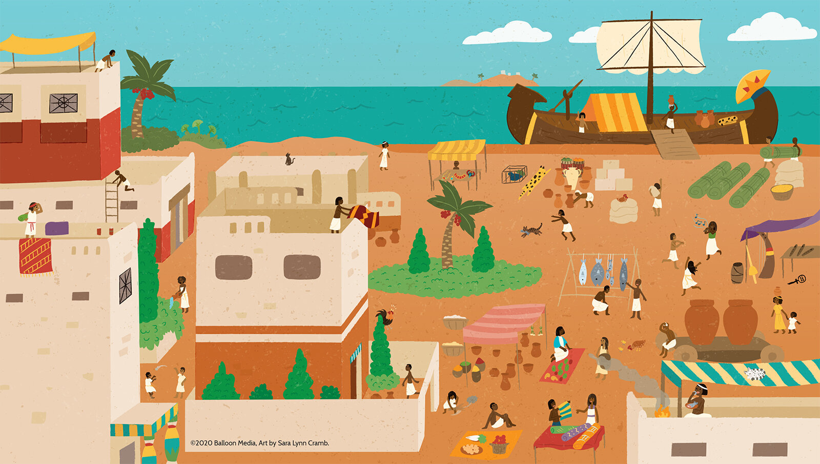
This illustration of an ancient Egyptian marketplace was created for a French language educational children’s activity book. Facts were included about the marketplace along with a search and find activity that encourages kids to find several objects in the image. There are several interesting character interactions within this image; including a cat running off with someone’s catch, dancing, bartering, and games. The characters in this image highlight some of the common activities that may have taken place in this culture at this time.
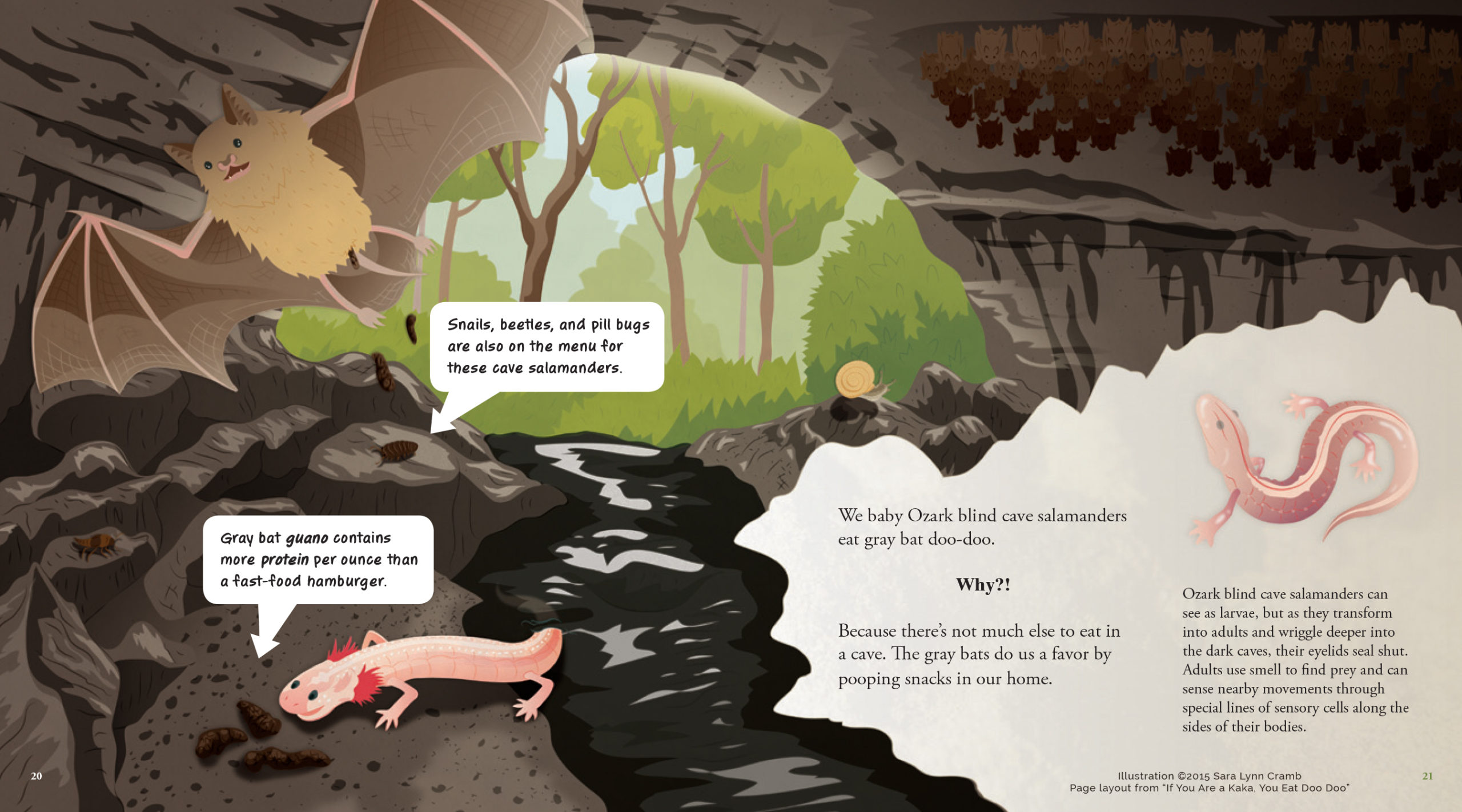
This illustration was created for a book about the ways in which different animals use poop to survive. I was able to use humor in a number of illustrations to highlight the information presented in the book. It not only serves to show you what the environment these species live in but also shows where the baby ozark blind cave salamander gets his protein. The humor here isn’t in the bat dropping his poops to the ground but in the salamander’s glee in his snack.
Conclusion – Young learners today can become the scientists, educators, and artists of tomorrow.
Illustration is a great way to connect with and inform young people. It can improve the retention of educational material which can benefit their educational future. I hope this article has opened your eyes to the world of child-focused educational illustration if you weren’t familiar with it before, and expanded your definition of what educational illustration can be. Keep in mind the ways in which including elements of accessibility, simplicity, and play can add an extra layer of connection and understanding to your work.
