When you think of quality science communication, what important features come to mind?
Perhaps you think of accuracy – quality science communication is accurate. Perhaps you think of honesty, stories, human characters, visual elements, weird or cool facts, entertainment, or conversation.
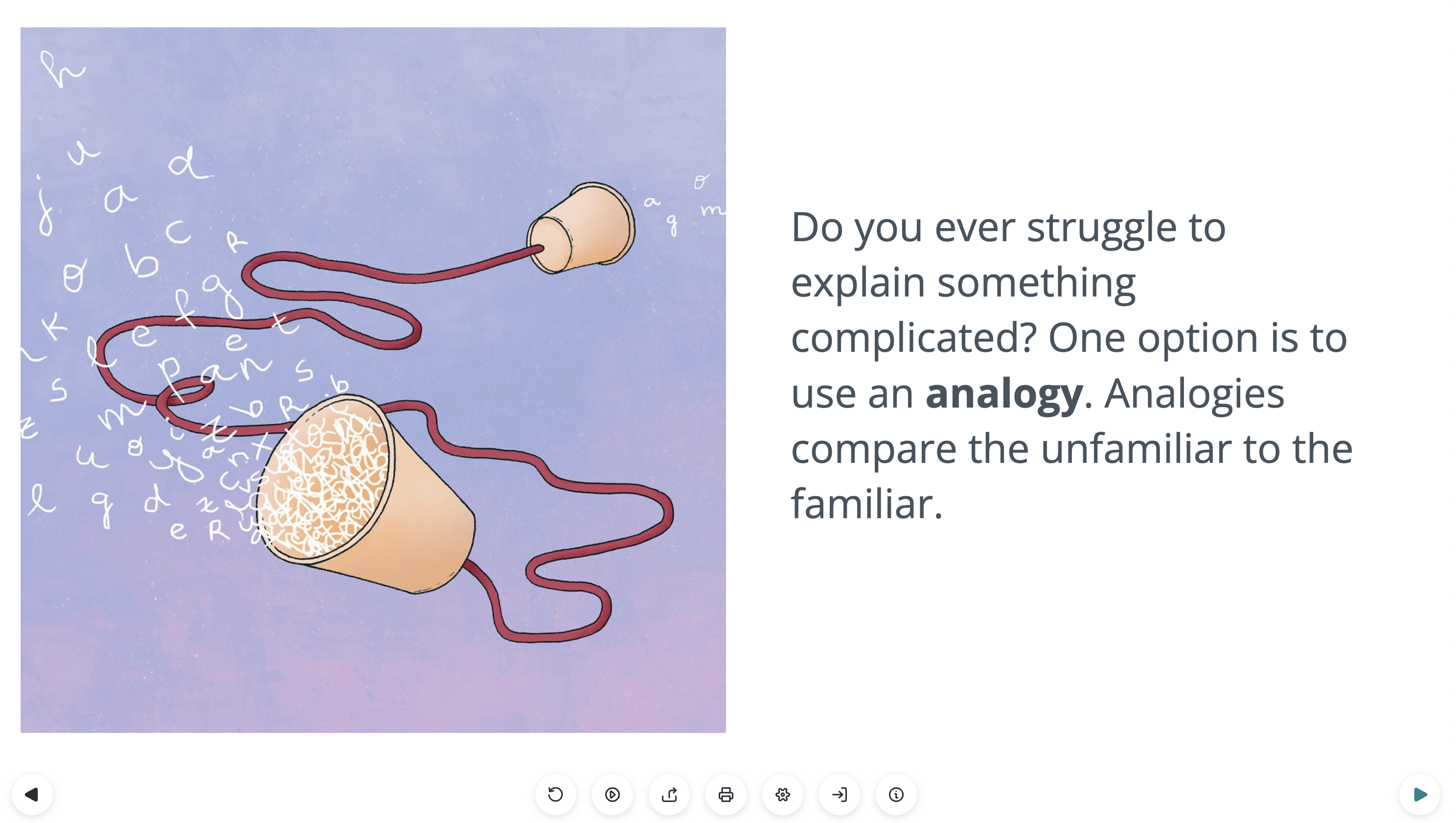
Do you think of beauty? What about style?
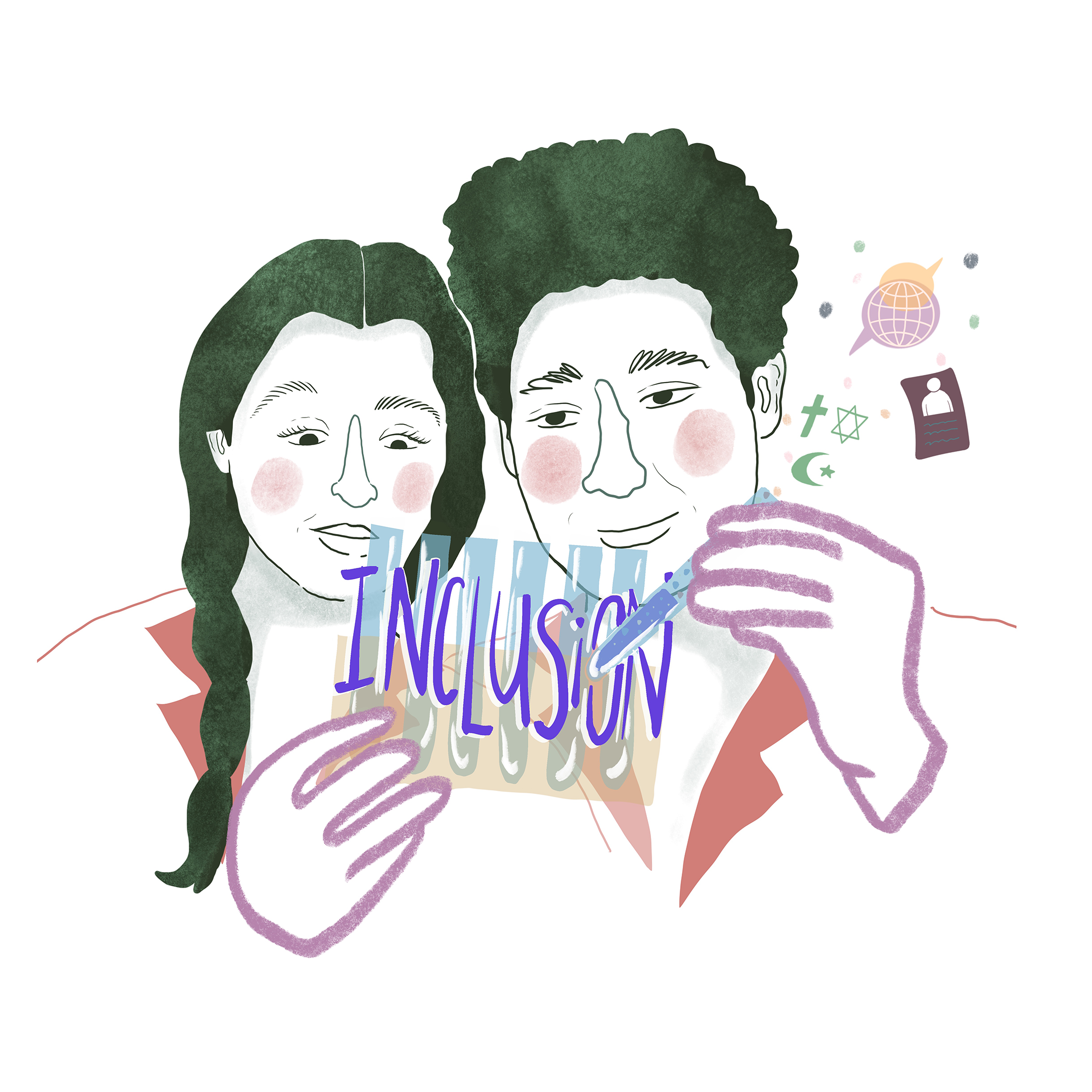
In a new and exciting Lifeology “flashcard” course that is a part of the Lifeology University SciComm Program, professor Massimiano Bucchi and illustrator Jordan Collver show why and how style can be a signal of quality in science communication. View the course and learn more from Massi and Jordan about the rationale and process for creating this course below! (Sign up to our SciComm program first if you want credit and to submit the post-course activity!)

From the Author – by Massimiano Bucchi
I am a professor of Science and Technology in Society and Director of International Master SCICOMM, UniTrento, Italy. I have always found it very important to add to my scholarly writing other, more accessible writing formats (theatre, dialogues) to make Science in Society and Scicomm themes more accessible since they matter to all citizens.
I have to say I honestly did not know about the digital flashcard format before Paige Jarreau contacted me, but I was happy and honored to accept this challenge. I had seen some comics about science by Jordan Collver and I thought his style would be highly suitable for the topic.
Jordan and I worked very well together since the beginning. After some meetings and exchanges, I came up with an initial draft for the Lifeology course that Jordan developed into a nice full storyboard.
Then the most difficult yet instructive part started, with a long process of fine-tuning and adjustments that substantially benefited from Paige’s input and invitations to sharpen and clarify each card to make it easily understandable and usable.
I am looking forward to seeing the feedback and comments on the “Style in Scicomm” course. I will certainly use and circulate this and other Lifeology courses in my teaching and communication activities. It is a very interesting format that appeals to a variety of international users and can help introduce new and particularly young audiences to SciComm topics.

From the Illustrator – Jordan Collver
Q: Can you tell us a little about your background?
I’m originally from Canada, where I studied history at university before moving to the UK and doing a master’s in science communication. As a former creationist, I knew firsthand the importance of good science communication. Doing SciArt seemed like the perfect opportunity to combine my late-blooming interest in science and my lifelong passion for drawing and nature.
Some of my favorite recent projects include illustrations for the Stated Clearly YouTube channel, creating a comic about research into the relationship between science and religion (My Evolution), developing illustrations for a vaccine training course and a policy document (Perspectives on Vaccination), and a comic series about the history and science of magic and the paranormal with Richard Wiseman (Hocus Pocus).
Q: How did you initially find Lifeology?
I came across Lifeology on Twitter, which caught my attention because I’m always looking for ways for experts and artists to connect and collaborate. I was particularly pleased to get to work with Massimiano Bucchi on this course, whose textbook I read during my scicomm course! I look forward to working on more Lifeology courses in the future.
Q: When looking at the script for the course what were your initial impressions?
When I read the first draft of the script, I was struck by how many very abstract ideas and concepts there were. This presented me with artistic challenges (how to represent something so conceptual?) and opportunities (fun visual metaphors!).
Rather than starting with a finished script which I would then go away and illustrate, Massimiano and I tried a slightly different process. He first wrote a rough outline of what content he wanted to include without worrying about how it would be broken up into flashcards. I then used this to see what visual ideas it triggered and pulled out sections that would make for good illustrations. This allowed us to group text based on what worked the best visually, and we then went on to hone the text and illustrations on each card from there – cutting, splitting and clarifying sections, all with invaluable guidance from Paige’s editing wizardry.
This process introduced some extra steps and kept evolving as I drew it, so it may have taken a bit longer to reach the final script. But it also made for a very iterative and collaborative experience, where it felt like I had meaningfully contributed to the script and Massimiano to the visual concepts. The end product is hopefully that the text and art function in tandem – where the illustrations are an integral part of the information, rather than just an accompaniment or add-on.
This is especially important in situations like Lifeology flashcards where space is tight and pithiness is key. By using visual metaphor and text-image juxtaposition, we can lean on the visuals to do a bit more work than just repeat the same information as the text. For instance, we wanted to include some concrete examples of “stylistic” scicomm in the course:
- Example 1: Earthrise, the famous image of the Earth from the Moon, is not just beautiful, but triggered a strong response in the audience (emotional and political), touching an audience that was ready for such a message and vision.
- Example 2: Rachel Carson’s book Silent Spring was not just based on relevant information, but conveyed in a strong and emotional prose.
But rather than devote two separate cards to explain this and risk the text becoming too long and complex, we decided it would be better to adhere to the adage “show don’t tell” and have these examples emerge from the imagery alongside existing text. And a good thing, too… Earthrise and Silent Spring became recurring visual motifs in the course.

Q: Do you use storyboarding in other work? How useful was it to your process?
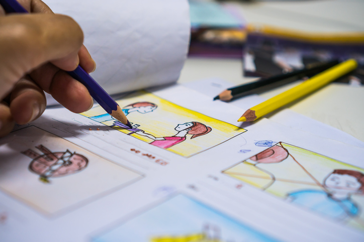
Definitely. I sketch out any ideas I get for drawings as I first read through a script. It’s a common and really useful practice in comic making called “thumbnailing.” These thumbnail sketches are so small and rough that they probably only make sense to me, but they’re useful in getting down thoughts and capturing inspiration as it comes. In fact, I usually don’t stray far too far from those initial sketches in my final drawing (except for where I decide to go in a different direction altogether). First instincts are often the best.
Q: Can you tell us a little more about how you get from visual idea to storyboard image to final rendered piece?
For this Lifeology course, I fleshed out the thumbnail/storyboard sketches a bit more in another round of rough pencils before penciling and inking the final piece on A4 paper, scanning it, and colouring it in Photoshop. I used a limited colour palette to bring visual coherence across all 33 illustrations in the course.

Q: What are your illustration tools of choice and why? Any recommendations to those starting out?
I combine traditional and digital formats. I prefer to work with ink and paper for my linework which I then tidy up and colour in Photoshop. My trusty tools include a Pentel 0.9mm mechanical pencil, Staedtler pigment liner pens, Pentel Japan brush pen, a chunky water-base pigment ink marker, and my Microsoft Surface Pro.
Seeing as my Lifeology course is about style in scicomm, my advice to artists starting out is to study and absorb the work of artists you admire, internalise it, and then just draw whatever comes most naturally to you without worrying about what your “style” is. You can waste so much creative energy (and confidence) comparing and second-guessing your art, but whatever comes out from the end of your pen is your style.
Oh and read a lot of comics! It doesn’t matter what the subject is; they’re not only packed with artwork but also narrative and storytelling techniques. See what works and try to figure out how/why.
Q: Tell us a little more about your other types of Art. Do you sell art?
Much of my work is freely available online (see links above) but you can order paper copies of my Hocus Pocus comics here. I am also selling original Hocus Pocus page art (ink on A3 Bristol board) and would be happy to sell any of the original illustrations or prints from my Lifeology course (ink on A4 printer paper) so please contact me if you’re interested: jordan.collver@gmail.com.