When creating Science Communication material, visual elements are essential for making it an engaging as possible – but this introduces an accessibility issue for the visually impaired audience. To foster inclusion in science and cater your Science Communication to all comers, you should consider using alt text on all your SciComm images!

Join the Lifeology Slack channel
At Lifeology, we’re happy to champion inclusiveness and accessibility in Science. This is one reason why we host an inclusive Slack channel that is a platform to discuss questions and ideas around Science Communication & SciArt.
This week, one of our channel members Sarah Ellinwood posed a question about how to make science visuals more accessible to those who rely on screenreaders. Of course, the Lifeology community delivered. Here’s what they had to say:
Sarah Ellingwood: Hi @channel – I want to pick everybody’s brains regarding alt text for scientific visuals. Our agency is looking to make our visuals more accessible to those who rely on screenreaders, but we’re struggling to draft alt text to accompany images that depict complex biological pathways, etc. Any tips or resources here we can look into? Thank you!
Rajamani: Hi Sarah, have you looked at biorender templates? That could be a source to look into.. I will respond back if I can think of something else..
Catherine Cheung: I second looking into biorender template/icons. Most recent icons are made with alt text. If not, you can always email creative@biorender.com and ask them to add it to the icon.
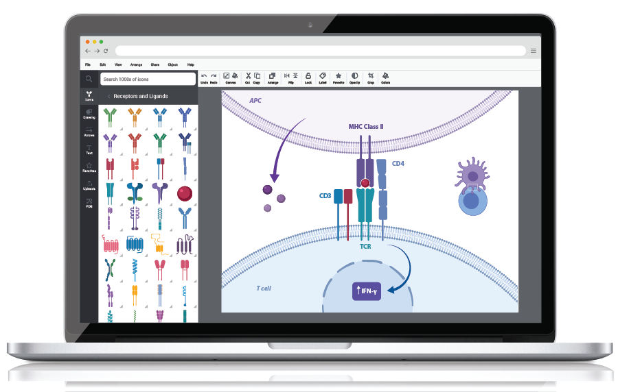
BioRender User Interface (biorender.com)
Gaius: I’m not sure of your specific use case, so I’ll give a more generic answer from my experience. I make all my own images or use those from other independent science artists, so this comes from that angle. IMO, graphics (“cartoons”) are meant to help a reader visually understand something that may or may not be explained elsewhere in text. Importantly, alt text is meant to describe the image to readers who cannot see visuals in general. In other words, in many cases (but not all), it acts as a REPLACEMENT for the visual. Therefore, any alt text you add should keep this in mind.
Here are just a couple of things to think about:
Is the process described elsewhere?
If so, you could copy this text into the alt text (thus repeating the text for screen readers, not always the best) OR you could simply have a description “Visual representation of X process.” Keep in mind that if you refer to the visual in your text, you need to add all the relevant information in the alt text to help them understand that text (eg, colors referenced, figure name/number). If the process is NOT anywhere else in the text, you should absolutely add a description of the process in the alt-text. In these cases, I tend to put all of the explanatory text from my infographics, plus any visual or scientific additional information needed to get across the same info as in the image.
Is there a more concise, clear text you could use to describe the process?
If so, the alt text is a good place for that, especially if it assists in understanding the overall page where the information sits.
Does my alt text fulfill its purpose?
After I’m done writing my alt text, I always ask this question. Why did I use this image? Just for decoration? To make a point not made elsewhere? Or to explain something visually that is already explained in text? Keep in mind that having some icons with alt text does NOT replace the need for a visual to describe a process. This is because it doesn’t describe the relationship between those icons.
Alt text for scientific images needs to go beyond automated descriptions (“yellow triangle”) and must consider its purpose within its context. Sorry this is long, but accessibility is one of my pain points. I hope this is a helpful starter for anyone who is trying to get started with this.
I think it’d be great to get some input on this from those who use screenreaders more often. I use a screenreader, but as an assistive device for reading, not for sight reasons.
Jordan Pennells: I’ll second Gaius seeing this is his area of expertise, but I’ll add this reference (Chiarella et al. 2020). This most relevant part is probably this:
“While the content of image descriptions will vary from person to person, a few key points should be considered when composing alt text. Keep in mind the purpose of the image and focus on describing the elements that further that purpose. When possible, avoid redundancies between image descriptions and the text of the tweet; e.g. avoid the use of phrases like “graphic shows” and “photo of,” since assistive technologies will identify the content as a graphic on their own. Do not include content such as links in alt text, since users of assistive technology cannot easily access the links. Instead, place links in the text of the tweet. Lastly, be as concise as possible with your descriptions (e.g., Fig. 1). Twitter limits alt text to 1000 characters per image and some older versions of assistive technology struggle with lengthy alt text.”
Then they include a few images with an alt text description as an example: