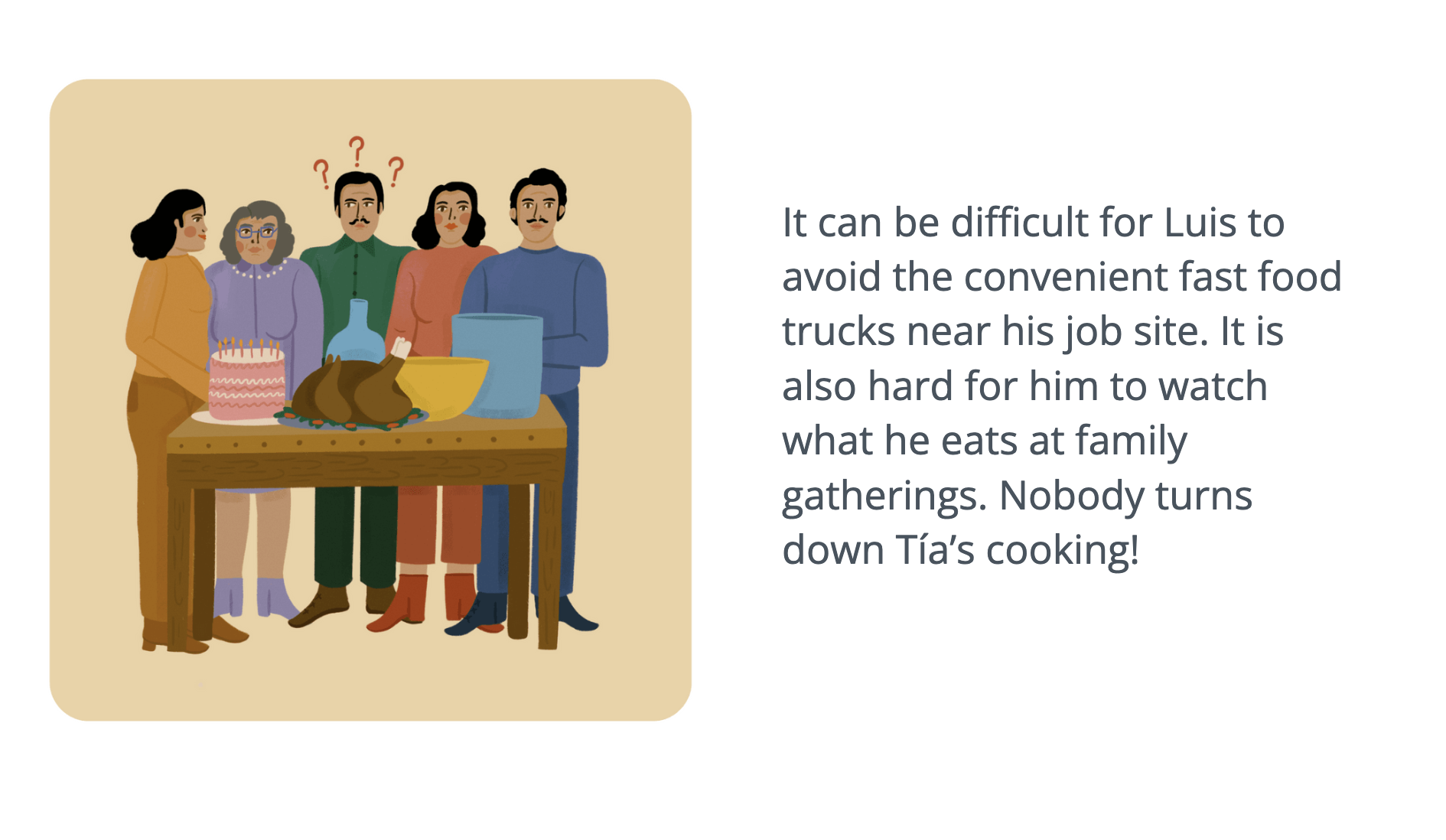
Lifeology courses are collaborative by nature. The artist is an integral part of course creation, it is their job to read the content and transform written language into a visual interpretation. It is of great importance that the images help the flow of information, and make the course more engaging and interesting.

Today, we are featuring Doryan Algarra, the co-founder of Lifeology, and the VP of Design at Lifeomic, and his recent work illustrating a Lifeology course about Airborne Infections.
Hi Doryan, can you tell us more about yourself, and the idea behind Lifeology?
I currently lead the design team at LifeOmic, which is charged with the overall design vision across many products. It’s an exciting role where I get to do a lot of creative things with great people.
In 2018, I thought up the idea of creating a web/mobile app to educate non-scientists about science/health. This was born from my personal journey as a non-scientist working for Lifeomic, a company entrenched in science and health. There was a lot I was excited to learn, but it can require in-depth research and understanding. I knew that there could be a better way for this exciting yet complex information to be delivered to make it less intimidating and more fun. You can read more about the story of Lifeology on the site.
Why did you decide to illustrate Lifeology’s latest course on airborne infection? How does illustrating a course differ from the design work that you do for Lifeomic?
In design work for Lifeology, I’ve drawn a lot of inspiration from one of the pioneers in airborne infection precautions – Florence Nightingale, aka the Lady with the Lamp. The Lifeology logo represents a nightingale inside of a crest, symbolizing our core beliefs, and gives homage to Florence Nightingale. When I read the script for our new course about Florence Nightingale and Airborne Infection, I was immediately drawn to the idea of illustrating it myself, given what’s happening in the world today regarding the pandemic and Lifeology’s personal ties to Florence. I felt drawn and inspired to illustrate this course.

As a designer for Lifeomic, I regularly create things like product interfaces, wireframes and user-journey flows, always with the intent of solving a problem. In doing this kind of work, there are inherent constraints that a designer must be aware of and overcome: established patterns, design systems, consistent elements for better user experience, etc.
With art/illustration for Lifeology courses, I’m given more freedom to interpret an idea that is unique. I can make creative choices on how the work is executed, the style and the emotions evoked. However, things like pattern still exist – it is important that the artwork within a Lifeology course is unified and has great visual flow, and it is also important that the visuals communicate an overarching message to the reader and enhance the learning experience.
“With art/illustration for Lifeology courses, I’m given more freedom to interpret an idea that is unique.”
How did you approach the task of illustrating the cards for the course “What Florence Nightingale taught us about airborne infection“?
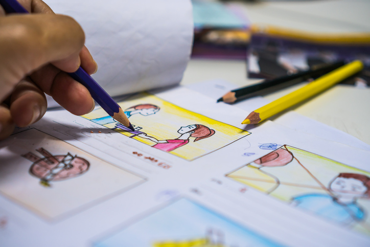
The first thing I did was read the course in its entirety. Whenever applicable, our writers create a story arc for these courses. Using a story arc is a great way to frame information around a relatable and understandable narrative. This also makes it easier for the artist to create a theme with recurring characters and elements. Early during the process of course creation, decisions are made regarding the course tone and audience. This is vital for the artist because it helps to define the style and approach to be used in the card images. So, for example, if the course was on a serious topic, a cartoon-style would not be appropriate.
This course was pretty flexible, so I used a fun and unique style to tell the story. The course also has a strong story arc. I was able to brainstorm ways the visual elements would be laid out and in what order. I then used Procreate to sketch initial thoughts and concepts, and developed a rough storyboard for the course visuals.
Lifeology storyboards are quick sketches of each card. Creating a storyboard allows me to quickly plan the ideas for each card and see whether they will flow well. A storyboard is also an excellent platform to use to discuss visual ideas with the writers, to ensure that everyone is on the same page before the final art is rendered.
“Using a story arc is a great way to frame information around a relatable and understandable narrative.”

I decided to choose a style that’s not grounded in realism, but is more expressive. I chose this style because it is universal and can work well across many demographics. For the color palette, I used darker colors for the screens with Florence, a historical character – while using the brighter colors for current day. This technique helped to visually group sections (past vs. present).
I also decided to animate individual cards. This is a concept I have been using in my personal work and wanted to explore further. The use of animation adds a new layer of enjoyment and interactivity for the reader.


Which illustration did you enjoy creating the most for this course, and why?
The image that sticks out is #31, it is the card that reads, “Most important of all, if you are sick, STAY HOME. This is the best way to prevent infection.”
I enjoyed this illustration because I took the idea of ‘staying home’ and used it as an opportunity to show the concept of remote working/socializing by way of a laptop and virtual discussion. It’s a simple concept, but I think it paired with the content nicely.
Can you give tips for making a cohesive card deck for a Lifeology course?
Some tips for a cohesive card deck:
Keep your style consistent. Once a style has been nailed down, make sure to keep that through to the end. There are cases when multiple styles make sense, but for the most part, keeping this consistent creates a better experience.
Use a consistent palette. Color is an excellent tool for creating cohesion. This can be done by using a limited color palette and using those on each card or using a consistent accent color(s) throughout the course. Either way, color is a great way to create unity and flow.
Recurring colors and elements. In some cases, the course will have a character or characters. Using them throughout the course will tie the cards together nicely. Recurring elements, such as textures or shapes, can also be an effective mechanism to evoke a sense of unity and cohesion.
How important is feedback throughout the creation process?
Feedback is crucial in the creation process, but most notably at the start. When trying to nail down the style of the art for a course, feedback is vital. The feedback will steer the artist towards a style that the team is aligned on. Once aligned, it allows the artist to complete the course, knowing that the style has been signed off.
How long have you been using Procreate?
I have been using Procreate, a digital illustration tool, for over a year now – it has been a game-changer. I use Procreate with an iPad Pro and an Apple Pencil – because of this, my entire art process is now digital.
This has had an enormous impact on my growth as an artist since it allows me to pick up and draw quickly. And because it’s so easy to get going, I draw almost every day. The art is digital and accessible, modifications can be made with ease, and getting the artwork web/social ready has increased my ability to share and get feedback quickly.


What are your tips for beginners using Procreate?
As a beginner, I would say the biggest challenge of going from traditional pencil and paper to iPad/Pencil + Procreate is the feel of the tool. Drawing on an iPad with an Apple Pencil will never replace the feeling of a pencil on paper, so embrace the change. Like anything, practice makes perfect. The more you draw using these modern tools the more you’ll get used to it.
“Like anything, practice makes perfect.”
Brushes are everything. Procreate comes with some really nice brushes as standard, but make sure to do a google search for free procreate brushes – there are plenty out there that will help you try new styles and variations and help you grow as an artist. I’m at the point now where I geek out pretty hard on Procreate brushes and don’t have any issues spending money on a great brush.