Participate in the Lifeology SciComm Challenge for June – Create and submit your own infographic by July 1!
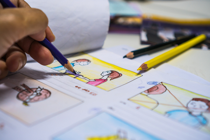
Designing an infographic isn’t as straightforward as “design and done”. It takes iteration and application of design skills to find the right balance of imagery and text. In this article, you’ll see the process I went through to design an infographic about asthma research.
Start with the text
I always start with identifying the key message for the infographic. After talking with the scientist and doing a bit of reading, I found it incredible that half of people with asthma don’t have their symptoms under control! The molecule they were working with targeted a protein that was involved in how the lungs handle inflammation. This could potentially be useful for people with moderate to severe asthma that current medications don’t control.
I thought this was a very important story, so I wrote out the text and asked the scientist to look over it. Expert review of a science art project is always useful. Lifeology’s illustrated courses are all reviewed by scientists whose research is relevant to the course.
Once I knew how much text I needed, I started creating sketches of what the final infographic might look like.
Sketch 1
Here’s the first sketch I made for the infographic. Important note: I never use my first drafts! Why? Because the first draft is where my most obvious and boring ideas usually are. Here, I knew that I wanted to feature the lungs as a central visual, but I wasn’t sure about the text. I made these boxes with headings, and it really feels like a scientific poster in many ways.

Infographic design sketch 1 by Gaius J. Augustus, PhD
But my biggest issue with this first design was that it was unbalanced. The left and bottom would have been heavy with text, and most of the visual elements would have been on the top/right.
Sketch 2
So, where do you start for a second draft? I chose to try to balance the composition by making it somewhat symmetrical. Take a look at this next sketch.
This design is definitely more balanced. I still featured the visual of the lungs, but now the text on the left balances the text on the right. But this design fails to have a straightforward flow of information.

Infographic design sketch 2 by Gaius J. Augustus, PhD
I asked myself “In what order will I read the text?” It was then that I realized that this design would need to be very carefully laid out in order for my audience to know what order to read it in. And the changes I would need to make to do that (ie, moving boxes of words around) meant that I’d probably end up with random empty space that would feel awkward.
Sketch 3
At this point, I was feeling like the text boxes were the problem. Why was I so tied to having text in these big, tidy boxes? So I decided to challenge myself: Create an infographic design with as few text boxes as possible! I didn’t worry about whether it would be perfect. I just wanted to do something different and see if it was a better starting point. And this is the sketch I came up with.

Infographic design sketch 3 by Gaius J. Augustus, PhD
The attention is on the graphics. The lungs take center stage, and the airway inset is highlighted. The text is placed where necessary, and many of the words are unnecessary because they come across better in visuals.
This felt right. It was balanced and interesting. And even though it was obvious that I had no idea how to draw lungs or an inhaler from memory, I knew that was the direction to go in.
Creating an infographic plan
From here, I moved into the digital realm. I started by collecting references and creating what I call an “Infographic Plan of Awesomeness” (you can pick up a copy of this worksheet on my website, as well as other resources for making infographics). In many ways, the infographic plan is like a mood board, a place to put all the stuff that I need before I start working on the final piece.
On this infographic plan, I broke down my text into four sections: background, main message, title, and other content. I placed my color palette, some references I knew I would need, and my final sketch into the plan.
Creating a plan before starting the actual art is important. First, it allows me to get input from the scientist early on in the process. But it also means less work in the end. I can’t imagine how long I would have spent on this infographic if I had just started trying to draw my first sketch!
This highlights the importance of iteration. My first idea will almost never be the best, but it’s important because it’s the first. It gives me a stepping stone, and allows me to jump off from that point while knowing I can always come back to that safe place if I need to. Without that, it’s easy to feel uninspired or scared that I won’t come up with a good design.
My first sketch ticked many of the right boxes. It would have been an ok infographic. But pushing that forward, iterating on the design, and forcing myself outside of the box (literally, in this case) turned an ok infographic into a good infographic.

Infographic design plan by Gaius J. Augustus, PhD
Finalizing the infographic design
I completed the infographic in Adobe Illustrator. But I want to remind you that the tools are not necessarily important here. I could have created this by hand, or in any number of digital design programs. More subtle iteration to the design went on until it was complete. In the timelapse of my process, I hope you can see how the idea morphed as I continued. Those changes become more subtle the closer to the end I get, but are still incredibly important.
I showed this version of the infographic to the scientist. After implementing the changes she asked for, I finalized the infographic design below. One of the final changes I made that I feel added some flavor was a subtle texture in the background. That detail may seem small, but it pulls the whole design together.
My infographic design process is not linear. I prepare the text, I create sketches, and I digitize the design. But each of these steps relies on iteration, each version improving on the last. Remember, if you take it too far, you can always back up. Never be afraid to play around or experiment with your designs.