Lifeology started as a simple idea – making science and health available to everyone from anywhere, in an accessible and modern way.
This concept was the driver behind the logo and branding of Lifeology. We wanted to create an easily identifiable symbol that would drive forward this idea.
So… what’s with the bird?
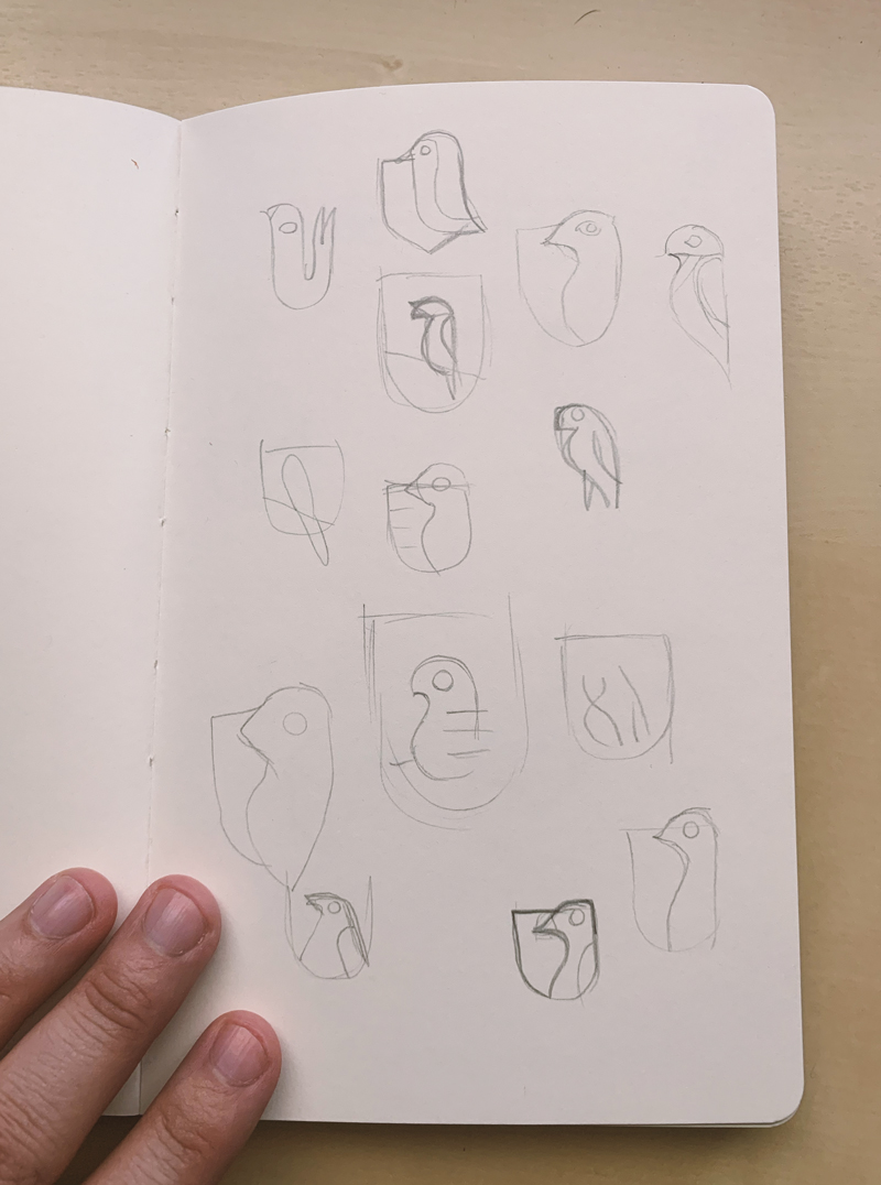
Initial sketches of the Lifeology logo
When I first sat down to sketch my ideas around the Lifeology logo, I had a couple of key characteristics that I wanted to integrate into the symbol. With the name “Lifeology” we are already evoking a sense of it being almost like a science itself. (-ology = a subject of study; a branch of knowledge.) “Life” is a word we often use in product and service names at LifeOmic to represent the idea that our software helps people make better decisions with data about their health. Adding the “ology” to “Life” for Lifeology almost immediately created a sense of this being a larger concept, almost like its own subject or topic that you would study. We think of Lifeology as a means for people to explore and learn about science and data all around them, to help them make better decisions in their daily lives about their health and more.
This intrigued me. I pursued a way for the logo to follow this momentum while keeping it modern and if possible, fun!

Our brand inspiration, Florence Nightingale
During my initial research, I reviewed many logos and organizations that had similar tones in regards to their mission – whether it was a teaching platform or a place to learn. I soon decided to lean into this concept of the logo being a representation of a place to learn and teach, which led me to the crest shape.
Universities and institutions of higher learning have a long and storied history of using a crest shape via a coat of arms as a symbol of their organizations. Coats of arms have been used as far back as the 12th century by nobility and are used to visually represent a person, family or organization. We leveraged this universally known design element along with the Lifeology name to create our own unique logo.
Okay…but still, what’s with the bird?
So once we had the basic silhouette and a sense of how this logo symbol would look, we needed to create our own unique symbol within our crest that would be the heart of our brand.
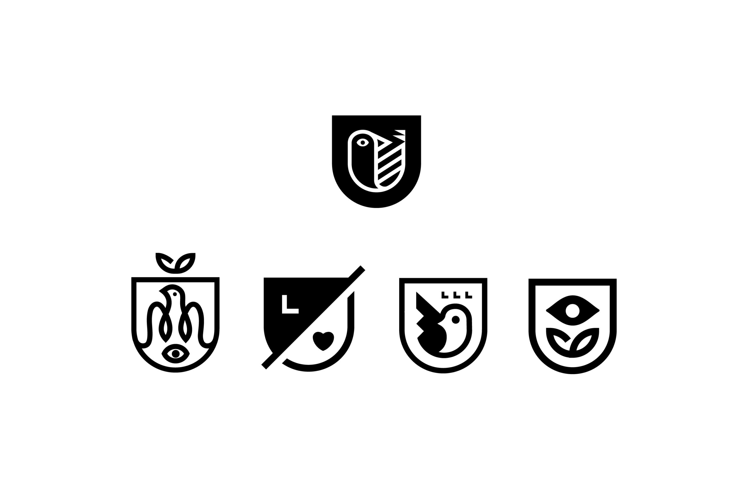
Evolution and variations on the logo
At Lifeology we are constantly inspired by the scientists, medical professionals and artists that we work with. We are also inspired by the scientists, medical professionals and artists of the past, and we wanted to bring that inspiration into the crest mark.
I should point out that an important element of what we do here at Lifeology is to represent minorities when it comes to science and art. We feel it’s important to represent and showcase minority members of this group as much as possible, to broaden the reach of scientific information and help more people “see” themselves in science and feel that they can participate. Science could and should be more diverse, so whenever possible we feel it’s vital to create those opportunities. This includes recruiting diverse science artists and writers to create for Lifeology courses and encouraging diverse representation of scientist and other “characters” in the illustrations of Lifeology courses.
Myself and Paige, who are both co-founders of Lifeology, are also both in minority groups, so we feel that it’s important for this platform to be inclusive of everyone and that minorities are integral to its growth and success.
With that being said, we created a short list of historical scientists and artists that we wanted to use as our inspiration, all within the context I described above. In the end, we decided that our inspiration would come from Florence Nightingale.
Florence Nightingale is most notably known as the founder of modern nursing (and data visualization!), but she was also a statistician and social reformer. Born on May 12, 1820, Florence, also known as “The Lady with the Lamp”, was a manager and trainer of nurses during the Crimean War, where she made the rounds tending to wounded soldiers during the night, hence the “Lady with the Lamp” moniker.
She was a prodigious writer, with much of her published work based on spreading medical knowledge – complete with visuals. She was also a pioneer in human and women’s rights by actively trying to reform healthcare for the underserved as well as expanding the workforce for women. As a statistician, Florence was also a pioneer in data visualization by using graphical presentations of her statistical data via infographics.
It became pretty evident to Paige and I that we had our inspiration. Through her beliefs and accomplishments, Florence Nightingale not only represents our ideals for accessible science/health knowledge for ALL, but also as a beacon for us to strive to.
It then became obvious to me to craft the main logo to represent a nightingale, perched inside the crest, symbolizing our core beliefs as well as giving homage to Florence Nightingale.
The final Lifeology logo
So there you have it, the origin of the Lifeology logo. Oh and by the way, if you’re wondering if the bird in the crest has a name – yes she does. Her name is Athena, named after Florence Nightingale’s pet owl, whom she rescued in Athens and became her constant companion, traveling in her pocket and medicine chest!