For June 2020, we challenged you to create your own infographic! In the end we received over 10 submissions! The winner of this month’s challenge was Lauren Kunselman’s infographic on ATAC-seq (Infographic #10), with their prize awating: a knitted science-inspired hat & the opportunity to translate the infographic into a Lifeology course for free!
Did you miss our June SciComm Challenge announcement? Don’t worry, we have another Challenge for July: Create a Science Poem!
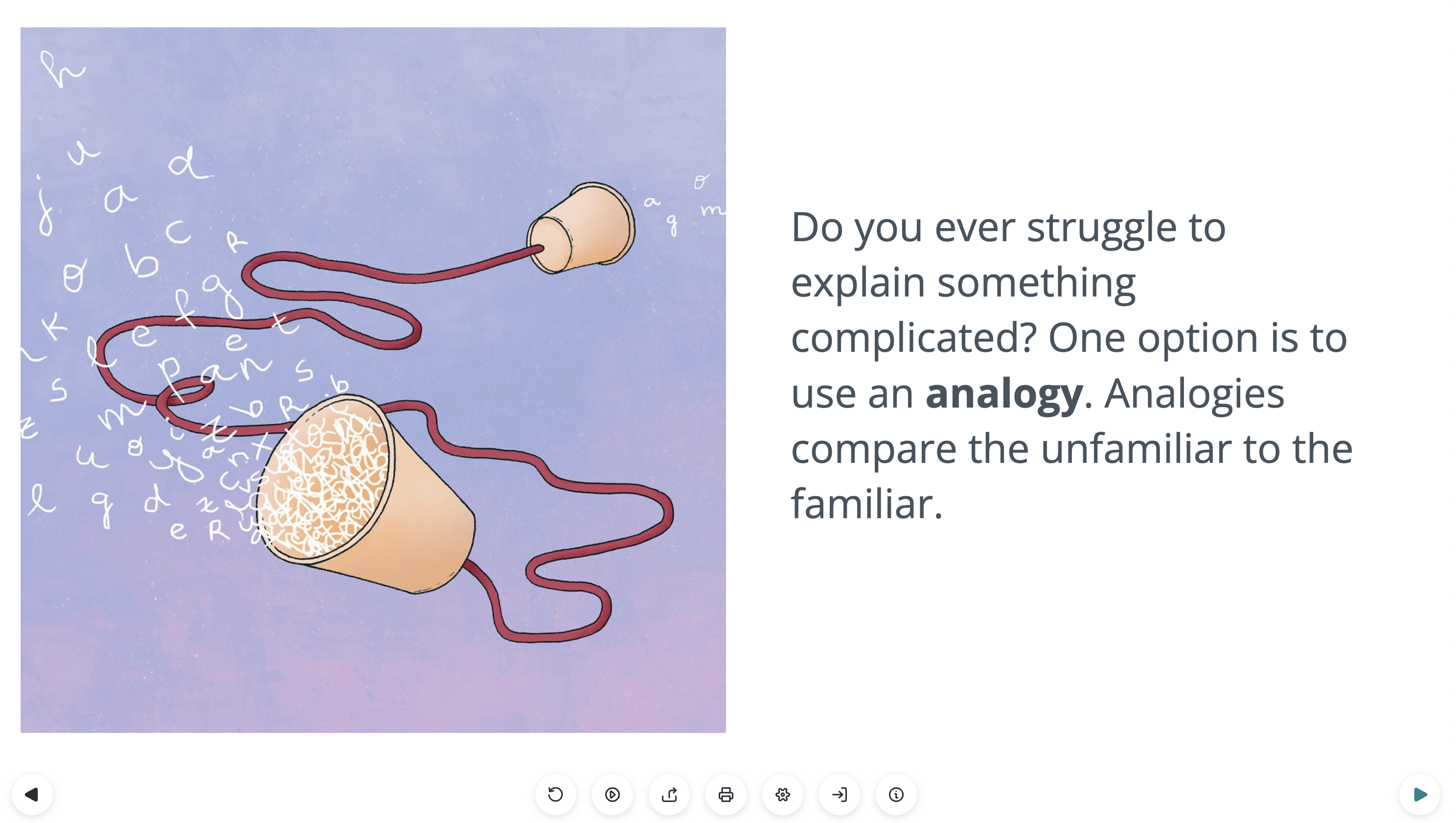
Below we’ve featured many of the submitted infographics, with a bit more information about them from the creators.
Infographic #1: Uncontrolled Asthma

Infographic by Gaius Augustus
With this infographic, I created a post for the Lifeology blog on how to design an infographic about asthma research. I always start with identifying the key message for the infographic. After talking with the scientist and doing a bit of reading, I found it incredible that half of people with asthma don’t have their symptoms under control! The molecule they were working with targeted a protein that was involved in how the lungs handle inflammation. This could potentially be useful for people with moderate to severe asthma that current medications don’t control.
My infographic design process is not linear. I prepare the text, I create sketches, and I digitize the design. But each of these steps relies on iteration, each version improving on the last. Remember, if you take it too far, you can always back up. Never be afraid to play around or experiment with your designs.
Infographic #2: Destroying Coronavirus

Infographic by Shira Gordon
The year is 2020 and a global pandemic has brought the world to a stop in a great pause like nothing we have experienced before. As we all stay at home and wait for this pandemic to become manageable, it helps to understand the methods that are being used to destroy coronavirus. Scientists are working hard to create vaccines, drugs, and other control methods, but with such rapidly changing information, it is hard to keep track of what we know. This infographic (and accompanying blog post) explains some of the methods, what we know about them, and how they work. Mechanisms are broken down into 1) outside the body (e.g., soaps, alcohol, and time), 2) drugs, 3) antibody treatments, and 4) vaccines.
Infographic #3: Wētā Mating Behaviour

Infographic by Sarah Nason
Have you ever heard of wētā? Maybe the word sounds familiar if you’re a fan of sci-fi and special effects, because of the famous visual effects house Weta Workshop based in New Zealand (they did the effects for Lord of the Rings!). Wētā are giant cricket-like insects that are uniquely found in Aotearoa/New Zealand. There are approximately 80 species of wētā, and they live all sorts of different lifestyles – from long-legged, jumping cave wētā (tokoriro) to slow-moving, veggie-crunching giant wētā (wētāpunga), they have adapted to just about every environment available to them in Aotearoa.
The latest infographic from Wapiti Studios helps to explain a recent study on the Wellington tree wētā, which is a species of tree-dwelling wētā called putangatanga. This study looked at a phenomenon called polyandry: females mating with multiple males (accompanying Lifeology blog post).
Infographic #4: Hand Sanitisers

Infographic by Andy Brunning
In a post for the Lifeology blog, I’ve draw on some of the things I’ve learned to highlight some of the key aspects of a good infographic and resources you can use to help you make your own. In the past seven years, I’ve made hundreds of infographics about various chemistry topics on Compound Interest, as well as making commissioned graphics for researchers and institutions. This infographic explains the chemistry of hand sanitisers.
Infographic #5: Climate Change Confidence & Likelihood

Infographic by Lydia Messling
Language is really important, and communicating uncertainties, particularly around climate change, is really difficult. For scientists, trying to explain the “so that then means…” of climate change can sometimes feel like they’re wandering outside of their expertise – they find it’s safer to use these defined terms to stipulate uncertainties and to accurately portray confidence levels. But these words have completely different meanings to your Average Joe. So I decided to make an infographic to explain these terms and the special way that scientists use them.
We know that some of the most important things about communicating climate change to different audiences is to engage with their values, to tell a human story, and to talk about real world examples (see this handy set of principles for climate scientists doing public engagement). So when I was doing this infographic, I wanted to help show the scientist-humans and their thought processes behind using these words, and relate them to other ‘real world’ examples that people might understand.
Infographic #6: Virus Spillover

Infographic by Corrado Minetti
We originally proposed to the University of Ferrara (where we all just got our Master’s degree in Science Journalism at the end of February) to make an infographic about the hypothesis of the origin of SARS-CoV2. We thought it was a timely and important topic, quite unknown to the public up to before the pandemic, and we decided to focus on how changes in the virus proteins allow it to jump species. We haven’t touched other determinants of spillovers in order to focus on one specific mechanism and avoid making the infographic too messy. The choice of the background simbolizes the network of connectivity between environments and animals (a pre-requisite for spillovers). We kept the text at a minimum, but we admit it was challenging to decide how to introduce (also visually) che spike protein and its changes. It required quite a lot of tweaks and changes to reach a product we were all happy with. Overall we had a lot of fun though, we all like visual media and we think infographics are one of the best ways to communicate scientific contents. They surely are a challenging format, particularly in how to balance the information given (not too little, not too much) and make it clear.
Infographic #7: How Bacteria Transport Lipids

Infographic by Sarah Wettstadt
But how do bacteria grow their membranes? How do they increase the surface of their membranes to hold the cell content?
When a bacterial cell grows, it needs to increase both the cell content and the cell envelope. For the outer membrane of Gram-negative bacteria to grow, bacteria have to transport lipids from the inner membrane through the periplasm. For this, they use transporters that work like ferries, tunnels and bridges. I answered these questions in more depth on my blog #sarahslittleworld.
Infographic #8: Cladograms

Infographic by Philippa Steinberg
This is my infographic challenge. It is a small guide to how to read cladograms and evolutionary trees, inspired by a class I took this semester.
Infographic #9: Polycystic Ovary Syndrome

Infographic by Jeff Pea
Hi everyone! I made this simple infographic relating to my work on reproductive disorders, specifically the diagnosis of polycystic ovary syndrome (PCOS).
Infographic #10: ATAC-Seq

Infographic by Lauren Kunselman
Infographic #11: Vaccine Development

Infographic by Nidhi Parekh